Table Of Contents
Widgets
Introduction to Widget
A Widget is the base building block of GUI interfaces in Kivy.
It provides a Canvas that can be used to draw on screen. It receives events
and reacts to them. For a in-depth explanation about the Widget class,
look at the module documentation.
Manipulating the Widget tree
Widgets in Kivy are organized in trees. Your
application has a root widget, which usually has children that can have
children of their own. Children of a widget are represented as the children
attribute, a Kivy ListProperty.
The widget tree can be manipulated with the following methods:
add_widget(): add a widget as a childremove_widget(): remove a widget from the children listclear_widgets(): remove all children from a widget
For example, if you want to add a button inside a BoxLayout, you can do:
layout = BoxLayout(padding=10)
button = Button(text='My first button')
layout.add_widget(button)
The button is added to layout: the button’s parent property will be set to layout; the layout will have the button added to its children list. To remove the button from the layout:
layout.remove_widget(button)
With removal, the button’s parent property will be set to None, and the layout will have button removed from its children list.
If you want to clear all the children inside a widget, use
clear_widgets() method:
layout.clear_widgets()
Warning
Never manipulate the children list yourself, unless you really know what you are doing. The widget tree is associated with a graphic tree. For example, if you add a widget into the children list without adding its canvas to the graphics tree, the widget will be a child, yes, but nothing will be drawn on the screen. Moreover, you might have issues on further calls of add_widget, remove_widget and clear_widgets.
Traversing the Tree
The Widget class instance’s children list property
contains all the children. You can easily traverse the tree by doing:
root = BoxLayout()
# ... add widgets to root ...
for child in root.children:
    print(child)
However, this must be used carefully. If you intend to modify the children list with one of the methods shown in the previous section, you must use a copy of the list like this:
for child in root.children[:]:
    # manipulate the tree. For example here, remove all widgets that have a
    # width < 100
    if child.width < 100:
        root.remove_widget(child)
Widgets don’t influence the size/pos of their children by default. The
pos attribute is the absolute position in screen co-ordinates (unless, you
use the relativelayout. More on that later) and size, is an absolute size.
Widgets Z Index
The order of widget drawing is based on the widget’s position in
the widget tree. The add_widget
method takes an index parameter which can be used to specify its position in
the widget tree:
root.add_widget(widget, index)
The lower indexed widgets will be drawn above those with a higher index. Keep in mind that the default for index is 0, so widgets added later are drawn on top of the others unless specified otherwise.
Organize with Layouts
layout is a special kind of widget that controls the size and position of
its children. There are different kinds of layouts, allowing for different
automatic organization of their children. Layouts use size_hint and pos_hint
properties to determine the size and pos of their children.
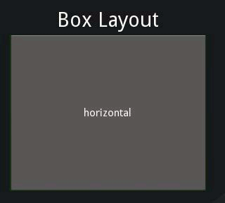
BoxLayout: Arranges widgets in an adjacent manner (either vertically or horizontally) manner, to fill all the space. The size_hint property of children can be used to change proportions allowed to each child, or set fixed size for some of them.
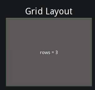
GridLayout: Arranges widgets in a grid. You must specify at least one dimension of the grid so kivy can compute the size of the elements and how to arrange them.
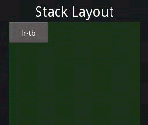
StackLayout: Arranges widgets adjacent to one another, but with a set size in one of the dimensions, without trying to make them fit within the entire space. This is useful to display children of the same predefined size.
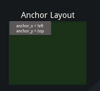
AnchorLayout: A simple layout only caring about children positions. It allows putting the children at a position relative to a border of the layout. size_hint is not honored.
FloatLayout: Allows placing children with arbitrary locations and size, either absolute or relative to the layout size. Default size_hint (1, 1) will make every child the same size as the whole layout, so you probably want to change this value if you have more than one child. You can set size_hint to (None, None) to use absolute size with size. This widget honors pos_hint also, which as a dict setting position relative to layout position.
RelativeLayout: Behaves just like FloatLayout, except children positions are relative to layout position, not the screen.
Examine the documentation of the individual layouts for a more in-depth understanding.
size_hint is a ReferenceListProperty of
size_hint_x and size_hint_y. It accepts values from 0 to 1 or None
and defaults to (1, 1). This signifies that if the widget is in a layout,
the layout will allocate it as much place as possible in both directions
(relative to the layouts size).
Setting size_hint to (0.5, 0.8), for example, will make the widget 50% the
width and 80% the height of available size for the Widget inside a layout.
Consider the following example:
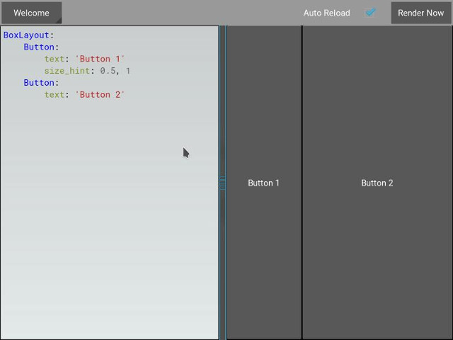
BoxLayout:
    Button:
        text: 'Button 1'
        # default size_hint is 1, 1, we don't need to specify it explicitly
        # however it's provided here to make things clear
        size_hint: 1, 1
Now load kivy catalog by typing the following, but replacing $KIVYDIR
with the directory of your installation (discoverable via
os.path.dirname(kivy.__file__)):
cd $KIVYDIR/examples/demo/kivycatalog
python main.py
A new window will appear. Click in the area below the ‘Welcome’ Spinner on the
left and replace the text there with your kv code from above.
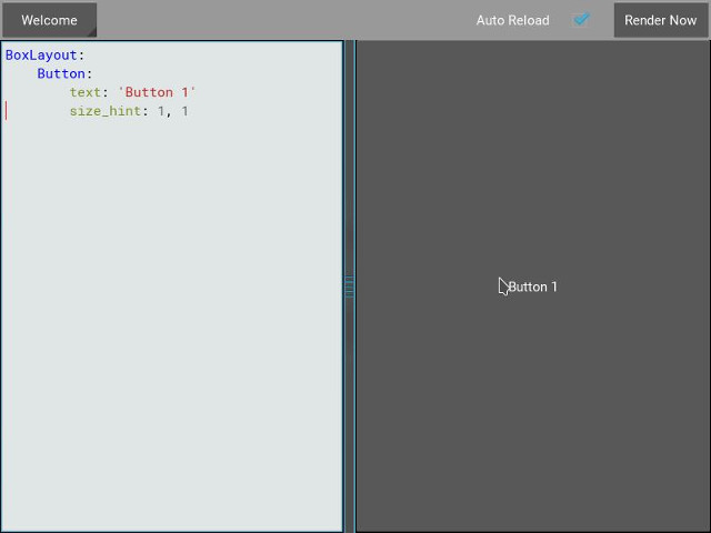
As you can see from the image above, the Button takes up 100% of the layout
size.
Changing the size_hint_x/size_hint_y to .5 will make the Widget take 50%
of the layout width/height.
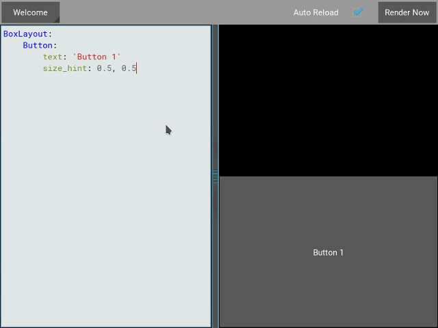
You can see here that, although we specify size_hint_x and size_hint_y both
to be .5, only size_hint_y seems to be honored. That is because boxlayout
controls the size_hint_y when orientation is vertical and size_hint_x
when orientation is ‘horizontal’. The controlled dimension’s size is calculated depending
upon the total no. of children in the boxlayout. In this example, one child has
size_hint_y controlled (.5/.5 = 1). Thus, the widget takes 100% of the parent
layout’s height.
Let’s add another Button to the layout and see what happens.
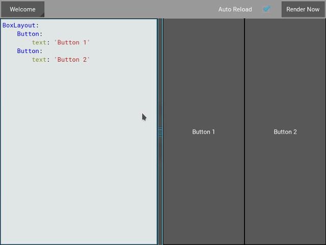
boxlayout by its very nature divides the available space between its
children equally. In our example, the proportion is 50-50, because we have two
children. Let’s use size_hint on one of the children and see the results.
If a child specifies size_hint, this specifies how much space the Widget
will take out of the size given to it by the boxlayout. In our example, the
first Button specifies .5 for size_hint_x. The space for the widget is
calculated like so:
first child's size_hint divided by
first child's size_hint + second child's size_hint + ...n(no of children)

.5/(.5+1) = .333...
The rest of the BoxLayout’s width is divided among the rest of the children.
In our example, this means the second Button takes up 66.66% of the layout
width.
Experiment with size_hint to get comfortable with it.
If you want to control the absolute size of a Widget, you can set
size_hint_x/size_hint_y or both to None so that the widget’s width and or
height attributes will be honored.
pos_hint is a dict, which defaults to empty. As for size_hint, layouts honor
pos_hint differently, but generally you can add values to any of the pos
attributes (x, y, right, top, center_x, center_y) to have the
Widget positioned relative to its parent.
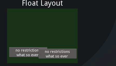
Let’s experiment with the following code in kivycatalog to understand pos_hint
visually:
FloatLayout:
    Button:
        text: "We Will"
        pos: 100, 100
        size_hint: .2, .4
    Button:
        text: "Wee Wiill"
        pos: 200, 200
        size_hint: .4, .2

    Button:
        text: "ROCK YOU!!"
        pos_hint: {'x': .3, 'y': .6}
        size_hint: .5, .2
This gives us:
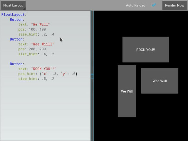
As with size_hint, you should experiment with pos_hint to
understand the effect it has on the widget positions.
Adding a Background to a Layout
One of the frequently asked questions about layouts is::
"How to add a background image/color/video/... to a Layout"
Layouts by their nature have no visual representation: they have no canvas instructions by default. However you can add canvas instructions to a layout instance easily, as with adding a colored background:
In Python:
from kivy.graphics import Color, Rectangle

with layout_instance.canvas.before:
    Color(0, 1, 0, 1) # green; colors range from 0-1 instead of 0-255
    self.rect = Rectangle(size=layout_instance.size,
                           pos=layout_instance.pos)
Unfortunately, this will only draw a rectangle at the layout’s initial position and size. To make sure the rect is drawn inside the layout, when the layout size/pos changes, we need to listen to any changes and update the rectangles size and pos. We can do that as follows:
with layout_instance.canvas.before:
    Color(0, 1, 0, 1) # green; colors range from 0-1 instead of 0-255
    self.rect = Rectangle(size=layout_instance.size,
                           pos=layout_instance.pos)

def update_rect(instance, value):
    instance.rect.pos = instance.pos
    instance.rect.size = instance.size

# listen to size and position changes
layout_instance.bind(pos=update_rect, size=update_rect)
In kv:
FloatLayout:
    canvas.before:
        Color:
            rgba: 0, 1, 0, 1
        Rectangle:
            # self here refers to the widget i.e FloatLayout
            pos: self.pos
            size: self.size
The kv declaration sets an implicit binding: the last two kv lines ensure that
the pos and size values of the rectangle will update when the pos of the
floatlayout changes.
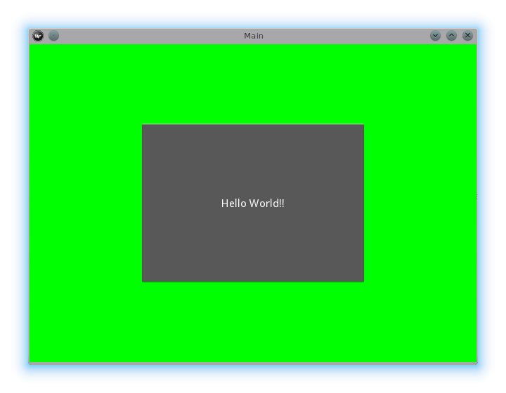
Now we put the snippets above into the shell of Kivy App.
Pure Python way:
from kivy.app import App
from kivy.graphics import Color, Rectangle
from kivy.uix.floatlayout import FloatLayout
from kivy.uix.button import Button


class RootWidget(FloatLayout):

    def __init__(self, **kwargs):
        # make sure we aren't overriding any important functionality
        super(RootWidget, self).__init__(**kwargs)

        # let's add a Widget to this layout
        self.add_widget(
            Button(
                text="Hello World",
                size_hint=(.5, .5),
                pos_hint={'center_x': .5, 'center_y': .5}))


class MainApp(App):

    def build(self):
        self.root = root = RootWidget()
        root.bind(size=self._update_rect, pos=self._update_rect)

        with root.canvas.before:
            Color(0, 1, 0, 1)  # green; colors range from 0-1 not 0-255
            self.rect = Rectangle(size=root.size, pos=root.pos)
        return root

    def _update_rect(self, instance, value):
        self.rect.pos = instance.pos
        self.rect.size = instance.size

if __name__ == '__main__':
    MainApp().run()
Using the kv Language:
from kivy.app import App
from kivy.lang import Builder


root = Builder.load_string('''
FloatLayout:
    canvas.before:
        Color:
            rgba: 0, 1, 0, 1
        Rectangle:
            # self here refers to the widget i.e FloatLayout
            pos: self.pos
            size: self.size
    Button:
        text: 'Hello World!!'
        size_hint: .5, .5
        pos_hint: {'center_x':.5, 'center_y': .5}
''')

class MainApp(App):

    def build(self):
        return root

if __name__ == '__main__':
    MainApp().run()
Both of the Apps should look something like this:
Add a color to the background of a custom layouts rule/class
The way we add background to the layout’s instance can quickly become cumbersome if we need to use multiple layouts. To help with this, you can subclass the Layout and create your own layout that adds a background.
Using Python:
from kivy.app import App
from kivy.graphics import Color, Rectangle
from kivy.uix.boxlayout import BoxLayout
from kivy.uix.floatlayout import FloatLayout
from kivy.uix.image import AsyncImage


class RootWidget(BoxLayout):
    pass


class CustomLayout(FloatLayout):

    def __init__(self, **kwargs):
        # make sure we aren't overriding any important functionality
        super(CustomLayout, self).__init__(**kwargs)

        with self.canvas.before:
            Color(0, 1, 0, 1)  # green; colors range from 0-1 instead of 0-255
            self.rect = Rectangle(size=self.size, pos=self.pos)

        self.bind(size=self._update_rect, pos=self._update_rect)

    def _update_rect(self, instance, value):
        self.rect.pos = instance.pos
        self.rect.size = instance.size


class MainApp(App):

    def build(self):
        root = RootWidget()
        c = CustomLayout()
        root.add_widget(c)
        c.add_widget(
            AsyncImage(
                source="http://www.everythingzoomer.com/wp-content/uploads/2013/01/Monday-joke-289x277.jpg",
                size_hint= (1, .5),
                pos_hint={'center_x':.5, 'center_y':.5}))
        root.add_widget(AsyncImage(source='http://www.stuffistumbledupon.com/wp-content/uploads/2012/05/Have-you-seen-this-dog-because-its-awesome-meme-puppy-doggy.jpg'))
        c = CustomLayout()
        c.add_widget(
            AsyncImage(
                source="http://www.stuffistumbledupon.com/wp-content/uploads/2012/04/Get-a-Girlfriend-Meme-empty-wallet.jpg",
                size_hint= (1, .5),
                pos_hint={'center_x':.5, 'center_y':.5}))
        root.add_widget(c)
        return root

if __name__ == '__main__':
    MainApp().run()
Using the kv Language:
from kivy.app import App
from kivy.uix.floatlayout import FloatLayout
from kivy.uix.boxlayout import BoxLayout
from kivy.lang import Builder


Builder.load_string('''
<CustomLayout>
    canvas.before:
        Color:
            rgba: 0, 1, 0, 1
        Rectangle:
            pos: self.pos
            size: self.size

<RootWidget>
    CustomLayout:
        AsyncImage:
            source: 'http://www.everythingzoomer.com/wp-content/uploads/2013/01/Monday-joke-289x277.jpg'
            size_hint: 1, .5
            pos_hint: {'center_x':.5, 'center_y': .5}
    AsyncImage:
        source: 'http://www.stuffistumbledupon.com/wp-content/uploads/2012/05/Have-you-seen-this-dog-because-its-awesome-meme-puppy-doggy.jpg'
    CustomLayout
        AsyncImage:
            source: 'http://www.stuffistumbledupon.com/wp-content/uploads/2012/04/Get-a-Girlfriend-Meme-empty-wallet.jpg'
            size_hint: 1, .5
            pos_hint: {'center_x':.5, 'center_y': .5}
''')

class RootWidget(BoxLayout):
    pass

class CustomLayout(FloatLayout):
    pass

class MainApp(App):

    def build(self):
        return RootWidget()

if __name__ == '__main__':
    MainApp().run()
Both of the Apps should look something like this:
Defining the background in the custom layout class, assures that it will be used in every instance of CustomLayout.
Now, to add an image or color to the background of a built-in Kivy layout, globally, we need to override the kv rule for the layout in question. Consider GridLayout:
<GridLayout>
    canvas.before:
        Color:
            rgba: 0, 1, 0, 1
        BorderImage:
            source: '../examples/widgets/sequenced_images/data/images/button_white.png'
            pos: self.pos
            size: self.size
Then, when we put this snippet into a Kivy app:
from kivy.app import App
from kivy.uix.floatlayout import FloatLayout
from kivy.lang import Builder


Builder.load_string('''
<GridLayout>
    canvas.before:
        BorderImage:
            # BorderImage behaves like the CSS BorderImage
            border: 10, 10, 10, 10
            source: '../examples/widgets/sequenced_images/data/images/button_white.png'
            pos: self.pos
            size: self.size

<RootWidget>
    GridLayout:
        size_hint: .9, .9
        pos_hint: {'center_x': .5, 'center_y': .5}
        rows:1
        Label:
            text: "I don't suffer from insanity, I enjoy every minute of it"
            text_size: self.width-20, self.height-20
            valign: 'top'
        Label:
            text: "When I was born I was so surprised; I didn't speak for a year and a half."
            text_size: self.width-20, self.height-20
            valign: 'middle'
            halign: 'center'
        Label:
            text: "A consultant is someone who takes a subject you understand and makes it sound confusing"
            text_size: self.width-20, self.height-20
            valign: 'bottom'
            halign: 'justify'
''')

class RootWidget(FloatLayout):
    pass


class MainApp(App):

    def build(self):
        return RootWidget()

if __name__ == '__main__':
    MainApp().run()
The result should look something like this:
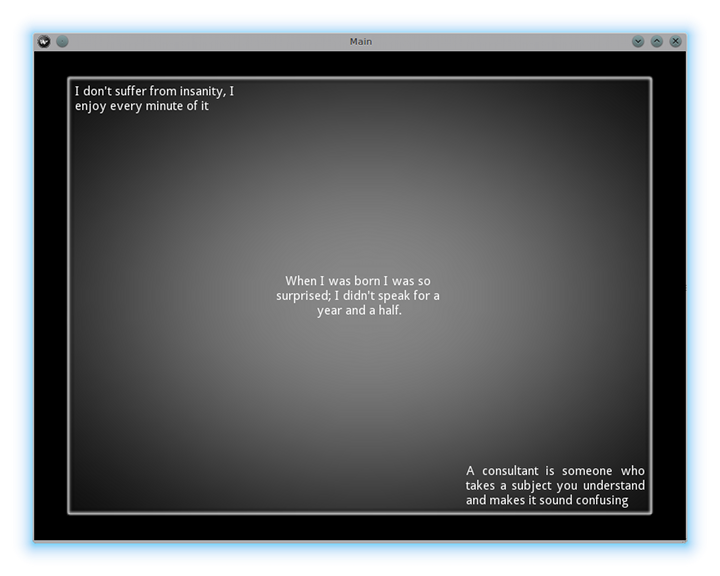
As we are overriding the rule of the class GridLayout, any use of this class in our app will display that image.
How about an Animated background?
You can set the drawing instructions like Rectangle/BorderImage/Ellipse/… to use a particular texture:
Rectangle:
    texture: reference to a texture
We use this to display an animated background:
from kivy.app import App
from kivy.uix.floatlayout import FloatLayout
from kivy.uix.gridlayout import GridLayout
from kivy.uix.image import Image
from kivy.properties import ObjectProperty
from kivy.lang import Builder


Builder.load_string('''
<CustomLayout>
    canvas.before:
        BorderImage:
            # BorderImage behaves like the CSS BorderImage
            border: 10, 10, 10, 10
            texture: self.background_image.texture
            pos: self.pos
            size: self.size

<RootWidget>
    CustomLayout:
        size_hint: .9, .9
        pos_hint: {'center_x': .5, 'center_y': .5}
        rows:1
        Label:
            text: "I don't suffer from insanity, I enjoy every minute of it"
            text_size: self.width-20, self.height-20
            valign: 'top'
        Label:
            text: "When I was born I was so surprised; I didn't speak for a year and a half."
            text_size: self.width-20, self.height-20
            valign: 'middle'
            halign: 'center'
        Label:
            text: "A consultant is someone who takes a subject you understand and makes it sound confusing"
            text_size: self.width-20, self.height-20
            valign: 'bottom'
            halign: 'justify'
''')


class CustomLayout(GridLayout):

    background_image = ObjectProperty(
        Image(
            source='../examples/widgets/sequenced_images/data/images/button_white_animated.zip',
            anim_delay=.1))


class RootWidget(FloatLayout):
    pass


class MainApp(App):

    def build(self):
        return RootWidget()

if __name__ == '__main__':
    MainApp().run()
To try to understand what is happening here, start from line 13:
texture: self.background_image.texture
This specifies that the texture property of BorderImage will be updated whenever the texture property of background_image updates. We define the background_image property at line 40:
background_image = ObjectProperty(...
This sets up background_image as an ObjectProperty in which we add an Image
widget. An image widget has a texture property; where you see
self.background_image.texture, this sets a reference, texture, to this property.
The Image widget supports animation: the texture of the image is updated whenever
the animation changes, and the texture of BorderImage instruction is updated in
the process.
You can also just blit custom data to the texture. For details, look at the
documentation of Texture.
Nesting Layouts
Yes! It is quite fun to see how extensible the process can be.
Size and position metrics
Kivy’s default unit for length is the pixel, all sizes and positions are expressed in it by default. You can express them in other units, which is useful to achieve better consistency across devices (they get converted to the size in pixels automatically).
Available units are pt, mm, cm, inch, dp and sp. You can learn about
their usage in the metrics documentation.
You can also experiment with the screen usage to simulate various devices
screens for your application.
Screen Separation with Screen Manager
If your application is composed of various screens, you likely want an easy
way to navigate from one Screen to another. Fortunately, there is the
ScreenManager class, that allows you to define screens separately, and to set
the TransitionBase from one to another.