Table Of Contents
- TabbedPanel
- Simple example
- Customize the Tabbed Panel
StripLayoutTabbedPanelTabbedPanel.add_widget()TabbedPanel.background_colorTabbedPanel.background_disabled_imageTabbedPanel.background_imageTabbedPanel.bar_widthTabbedPanel.borderTabbedPanel.clear_widgets()TabbedPanel.contentTabbedPanel.current_tabTabbedPanel.default_tabTabbedPanel.default_tab_clsTabbedPanel.default_tab_contentTabbedPanel.default_tab_textTabbedPanel.do_default_tabTabbedPanel.remove_widget()TabbedPanel.scroll_typeTabbedPanel.strip_borderTabbedPanel.strip_imageTabbedPanel.switch_to()TabbedPanel.tab_heightTabbedPanel.tab_listTabbedPanel.tab_posTabbedPanel.tab_width
TabbedPanelContentTabbedPanelExceptionTabbedPanelHeaderTabbedPanelItemTabbedPanelStrip
TabbedPanel
Added in version 1.3.0.
The TabbedPanel widget manages different widgets in tabs, with a header area for the actual tab buttons and a content area for showing the current tab content.
The TabbedPanel provides one default tab.
Simple example
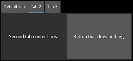
'''
TabbedPanel
============

Test of the widget TabbedPanel.
'''

from kivy.app import App
from kivy.uix.tabbedpanel import TabbedPanel
from kivy.lang import Builder

Builder.load_string("""

<Test>:
    size_hint: .5, .5
    pos_hint: {'center_x': .5, 'center_y': .5}
    do_default_tab: False

    TabbedPanelItem:
        text: 'first tab'
        Label:
            text: 'First tab content area'
    TabbedPanelItem:
        text: 'tab2'
        BoxLayout:
            Label:
                text: 'Second tab content area'
            Button:
                text: 'Button that does nothing'
    TabbedPanelItem:
        text: 'tab3'
        RstDocument:
            text:
                '\\n'.join(("Hello world", "-----------",
                "You are in the third tab."))

""")


class Test(TabbedPanel):
    pass


class TabbedPanelApp(App):
    def build(self):
        return Test()


if __name__ == '__main__':
    TabbedPanelApp().run()
Note
A new class TabbedPanelItem has been introduced in 1.5.0 for
convenience. So now one can simply add a TabbedPanelItem to a
TabbedPanel and content to the TabbedPanelItem
as in the example provided above.
Customize the Tabbed Panel
You can choose the position in which the tabs are displayed:
tab_pos = 'top_mid'
An individual tab is called a TabbedPanelHeader. It is a special button containing a content property. You add the TabbedPanelHeader first, and set its content property separately:
tp = TabbedPanel()
th = TabbedPanelHeader(text='Tab2')
tp.add_widget(th)
An individual tab, represented by a TabbedPanelHeader, needs its content set. This content can be any widget. It could be a layout with a deep hierarchy of widgets, or it could be an individual widget, such as a label or a button:
th.content = your_content_instance
There is one “shared” main content area active at any given time, for all the tabs. Your app is responsible for adding the content of individual tabs and for managing them, but it’s not responsible for content switching. The tabbed panel handles switching of the main content object as per user action.
There is a default tab added when the tabbed panel is instantiated. Tabs that you add individually as above, are added in addition to the default tab. Thus, depending on your needs and design, you will want to customize the default tab:
tp.default_tab_text = 'Something Specific To Your Use'
The default tab machinery requires special consideration and management. Accordingly, an on_default_tab event is provided for associating a callback:
tp.bind(default_tab = my_default_tab_callback)
It’s important to note that by default, default_tab_cls is of type
TabbedPanelHeader and thus has the same properties as other tabs.
Since 1.5.0, it is now possible to disable the creation of the
default_tab by setting do_default_tab to False.
Tabs and content can be removed in several ways:
tp.remove_widget(widget/tabbed_panel_header)
or
tp.clear_widgets() # to clear all the widgets in the content area
or
tp.clear_tabs() # to remove the TabbedPanelHeaders
To access the children of the tabbed panel, use content.children:
tp.content.children
To access the list of tabs:
tp.tab_list
To change the appearance of the main tabbed panel content:
background_color = (1, 0, 0, .5) #50% translucent red
border = [0, 0, 0, 0]
background_image = 'path/to/background/image'
To change the background of a individual tab, use these two properties:
tab_header_instance.background_normal = 'path/to/tab_head/img'
tab_header_instance.background_down = 'path/to/tab_head/img_pressed'
A TabbedPanelStrip contains the individual tab headers. To change the appearance of this tab strip, override the canvas of TabbedPanelStrip. For example, in the kv language:
<TabbedPanelStrip>
    canvas:
        Color:
            rgba: (0, 1, 0, 1) # green
        Rectangle:
            size: self.size
            pos: self.pos
By default the tabbed panel strip takes its background image and color from the tabbed panel’s background_image and background_color.
- class kivy.uix.tabbedpanel.StripLayout(**kwargs)[source]
Bases:
GridLayoutThe main layout that is used to house the entire tabbedpanel strip including the blank areas in case the tabs don’t cover the entire width/height.
Added in version 1.8.0.
- background_image
Background image to be used for the Strip layout of the TabbedPanel.
background_imageis aStringPropertyand defaults to a transparent image.
- border
Border property for the
background_image.borderis aListPropertyand defaults to [4, 4, 4, 4]
- class kivy.uix.tabbedpanel.TabbedPanel(**kwargs)[source]
Bases:
GridLayoutThe TabbedPanel class. See module documentation for more information.
- add_widget(widget, *args, **kwargs)[source]
Add a new widget as a child of this widget.
- Parameters:
- widget:
Widget Widget to add to our list of children.
- index: int, defaults to 0
Index to insert the widget in the list. Notice that the default of 0 means the widget is inserted at the beginning of the list and will thus be drawn on top of other sibling widgets. For a full discussion of the index and widget hierarchy, please see the Widgets Programming Guide.
Added in version 1.0.5.
- canvas: str, defaults to None
Canvas to add widget’s canvas to. Can be ‘before’, ‘after’ or None for the default canvas.
Added in version 1.9.0.
- widget:
>>> from kivy.uix.button import Button
>>> from kivy.uix.slider import Slider
>>> root = Widget()
>>> root.add_widget(Button())
>>> slider = Slider()
>>> root.add_widget(slider)
- background_color
Background color, in the format (r, g, b, a).
background_coloris aColorPropertyand defaults to [1, 1, 1, 1].Changed in version 2.0.0: Changed from
ListPropertytoColorProperty.
- background_disabled_image
Background image of the main shared content object when disabled.
Added in version 1.8.0.
background_disabled_imageis aStringPropertyand defaults to ‘atlas://data/images/defaulttheme/tab’.
- background_image
Background image of the main shared content object.
background_imageis aStringPropertyand defaults to ‘atlas://data/images/defaulttheme/tab’.
- bar_width
Width of the horizontal scroll bar. The width is interpreted as a height for the horizontal bar.
Added in version 2.2.0.
bar_widthis aNumericPropertyand defaults to 2.
- border
Border used for
BorderImagegraphics instruction, used itself forbackground_image. Can be changed for a custom background.It must be a list of four values: (bottom, right, top, left). Read the BorderImage instructions for more information.
borderis aListPropertyand defaults to (16, 16, 16, 16)
- clear_widgets(*args, **kwargs)[source]
Remove all (or the specified)
childrenof this widget. If the ‘children’ argument is specified, it should be a list (or filtered list) of children of the current widget.Changed in version 1.8.0: The children argument can be used to specify the children you want to remove.
Changed in version 2.1.0: Specifying an empty
childrenlist leaves the widgets unchanged. Previously it was treated likeNoneand all children were removed.
- content
This is the object holding (current_tab’s content is added to this) the content of the current tab. To Listen to the changes in the content of the current tab, you should bind to current_tabs content property.
contentis anObjectPropertyand defaults to ‘None’.
- current_tab
Links to the currently selected or active tab.
Added in version 1.4.0.
current_tabis anAliasProperty, read-only.
- default_tab
Holds the default tab.
Note
For convenience, the automatically provided default tab is deleted when you change default_tab to something else. As of 1.5.0, this behavior has been extended to every default_tab for consistency and not just the automatically provided one.
default_tabis anAliasProperty.
- default_tab_cls
Specifies the class to use for the styling of the default tab.
Added in version 1.4.0.
Warning
default_tab_cls should be subclassed from TabbedPanelHeader
default_tab_clsis anObjectPropertyand defaults to TabbedPanelHeader. If you set a string, theFactorywill be used to resolve the class.Changed in version 1.8.0: The
Factorywill resolve the class if a string is set.
- default_tab_content
Holds the default tab content.
default_tab_contentis anAliasProperty.
- default_tab_text
Specifies the text displayed on the default tab header.
default_tab_textis aStringPropertyand defaults to ‘default tab’.
- do_default_tab
Specifies whether a default_tab head is provided.
Added in version 1.5.0.
do_default_tabis aBooleanPropertyand defaults to ‘True’.
- remove_widget(widget, *args, **kwargs)[source]
Remove a widget from the children of this widget.
- Parameters:
- widget:
Widget Widget to remove from our children list.
- widget:
>>> from kivy.uix.button import Button
>>> root = Widget()
>>> button = Button()
>>> root.add_widget(button)
>>> root.remove_widget(button)
- scroll_type
Sets the type of scrolling to use for the content of the scrollview. Available options are: [‘content’], [‘bars’], [‘bars’, ‘content’].
Added in version 2.2.0.
scroll_typeis anOptionPropertyand defaults to [‘content’].
- strip_border
Border to be used on
strip_image.Added in version 1.8.0.
strip_borderis aListPropertyand defaults to [4, 4, 4, 4].
- strip_image
Background image of the tabbed strip.
Added in version 1.8.0.
strip_imageis aStringPropertyand defaults to a empty image.
- switch_to(header, do_scroll=False)[source]
Switch to a specific panel header.
Changed in version 1.10.0.
If used with do_scroll=True, it scrolls to the header’s tab too.
switch_to()cannot be called from within theTabbedPanelor its subclass’__init__method. If that is required, use theClockto schedule it. See discussion for full example.
- tab_height
Specifies the height of the tab header.
tab_heightis aNumericPropertyand defaults to 40.
- tab_list
List of all the tab headers.
tab_listis anAliasPropertyand is read-only.
- tab_pos
Specifies the position of the tabs relative to the content. Can be one of: left_top, left_mid, left_bottom, top_left, top_mid, top_right, right_top, right_mid, right_bottom, bottom_left, bottom_mid, bottom_right.
tab_posis anOptionPropertyand defaults to ‘top_left’.
- tab_width
Specifies the width of the tab header.
tab_widthis aNumericPropertyand defaults to 100.
- class kivy.uix.tabbedpanel.TabbedPanelContent(**kwargs)[source]
Bases:
FloatLayoutThe TabbedPanelContent class.
- exception kivy.uix.tabbedpanel.TabbedPanelException[source]
Bases:
ExceptionThe TabbedPanelException class.
- class kivy.uix.tabbedpanel.TabbedPanelHeader(**kwargs)[source]
Bases:
ToggleButtonA Base for implementing a Tabbed Panel Head. A button intended to be used as a Heading/Tab for a TabbedPanel widget.
You can use this TabbedPanelHeader widget to add a new tab to a TabbedPanel.
- content
Content to be loaded when this tab header is selected.
contentis anObjectPropertyand defaults to None.
- on_release(*largs)[source]
Event handler called when the button is released.
This event is fired when the last active touch is released, and only if: - The touch is released within button bounds, OR - The always_release property is True
- Parameters:
touch – The
MotionEventof the last touch being released. In multi-touch scenarios, this is the touch that completed the release action.
Example:
def on_release(self, touch):
    print(f"Released at position: {touch.pos}")
    duration = touch.time_end - touch.time_start
    print(f"Touch duration: {duration:.2f}s")
- on_touch_down(touch)[source]
Handle touch down events.
Implements core press detection:
Test collision with widget bounds
Grab touch if colliding (marks widget as touch owner)
Add to active touches tracking
Dispatch
on_press()on first touch
- Parameters:
touch –
MotionEventinstance- Returns:
True if event was handled (collided with widget)
- on_touch_up(touch)[source]
Handle touch up events.
Implements release detection:
Verify we own this touch
Ungrab touch to release ownership
Remove from active/cancelled tracking
Dispatch
on_release()if appropriate: - Touch wasn’t cancelled, AND - (Touch ended within bounds ORalways_releaseis True), AND - This was the last active touch
- Parameters:
touch –
MotionEventinstance- Returns:
True if event was handled
- class kivy.uix.tabbedpanel.TabbedPanelItem(**kwargs)[source]
Bases:
TabbedPanelHeaderThis is a convenience class that provides a header of type TabbedPanelHeader and links it with the content automatically. Thus facilitating you to simply do the following in kv language:
<TabbedPanel>:
    # ...other settings
    TabbedPanelItem:
        BoxLayout:
            Label:
                text: 'Second tab content area'
            Button:
                text: 'Button that does nothing'
Added in version 1.5.0.
- add_widget(widget, *args, **kwargs)[source]
Add a new widget as a child of this widget.
- Parameters:
- widget:
Widget Widget to add to our list of children.
- index: int, defaults to 0
Index to insert the widget in the list. Notice that the default of 0 means the widget is inserted at the beginning of the list and will thus be drawn on top of other sibling widgets. For a full discussion of the index and widget hierarchy, please see the Widgets Programming Guide.
Added in version 1.0.5.
- canvas: str, defaults to None
Canvas to add widget’s canvas to. Can be ‘before’, ‘after’ or None for the default canvas.
Added in version 1.9.0.
- widget:
>>> from kivy.uix.button import Button
>>> from kivy.uix.slider import Slider
>>> root = Widget()
>>> root.add_widget(Button())
>>> slider = Slider()
>>> root.add_widget(slider)
- class kivy.uix.tabbedpanel.TabbedPanelStrip(**kwargs)[source]
Bases:
GridLayoutA strip intended to be used as background for Heading/Tab. This does not cover the blank areas in case the tabs don’t cover the entire width/height of the TabbedPanel(use
StripLayoutfor that).- tabbed_panel
Link to the panel that the tab strip is a part of.
tabbed_panelis anObjectPropertyand defaults to None .