Table Of Contents
- Accordion
- Simple example
- Customize the accordion
AccordionAccordionExceptionAccordionItemAccordionItem.accordionAccordionItem.add_widget()AccordionItem.background_disabled_normalAccordionItem.background_disabled_selectedAccordionItem.background_normalAccordionItem.background_selectedAccordionItem.collapseAccordionItem.collapse_alphaAccordionItem.containerAccordionItem.container_titleAccordionItem.content_sizeAccordionItem.min_spaceAccordionItem.on_touch_down()AccordionItem.orientationAccordionItem.remove_widget()AccordionItem.titleAccordionItem.title_class
AccordionItemTitle
Accordion
Added in version 1.0.8.
The Accordion widget is a form of menu where the options are stacked either vertically or horizontally and the item in focus (when touched) opens up to display its content.
The Accordion should contain one or many AccordionItem
instances, each of which should contain one root content widget. You’ll end up
with a Tree something like this:
Accordion
AccordionItem
YourContent
AccordionItem
BoxLayout
Another user content 1
Another user content 2
AccordionItem
Another user content
The current implementation divides the AccordionItem into two parts:
One container for the title bar
One container for the content
The title bar is rendered by the AccordionItemTitle widget. To
customize the design of the title bar, subclass AccordionItemTitle
(or any other widget that exposes title and item properties) and
assign your class to AccordionItem.title_class.
Warning
If you see message like:
[WARNING] [Accordion] not have enough space for displaying all children
[WARNING] [Accordion] need 440px, got 100px
[WARNING] [Accordion] layout aborted.
That means you have too many children and there is no more space to
display the content. This is “normal” and nothing will be done. Try to
increase the space for the accordion or reduce the number of children. You
can also reduce the Accordion.min_space.
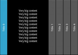
Simple example
from kivy.uix.accordion import Accordion, AccordionItem
from kivy.uix.label import Label
from kivy.app import App


class AccordionApp(App):
    def build(self):
        root = Accordion()
        for x in range(5):
            item = AccordionItem(title='Title %d' % x)
            item.add_widget(Label(text='Very big content\n' * 10))
            root.add_widget(item)
        return root


if __name__ == '__main__':
    AccordionApp().run()
Customize the accordion
You can increase the default size of the title bar:
root = Accordion(min_space=60)
Or change the orientation to vertical:
root = Accordion(orientation='vertical')
The AccordionItem is more configurable and you can set your own title background when the item is collapsed or opened:
item = AccordionItem(background_normal='image_when_collapsed.png',
    background_selected='image_when_selected.png')
- class kivy.uix.accordion.Accordion(**kwargs)[source]
Bases:
WidgetAccordion class. See module documentation for more information.
- add_widget(widget, *args, **kwargs)[source]
Add a new widget as a child of this widget.
- Parameters:
- widget:
Widget Widget to add to our list of children.
- index: int, defaults to 0
Index to insert the widget in the list. Notice that the default of 0 means the widget is inserted at the beginning of the list and will thus be drawn on top of other sibling widgets. For a full discussion of the index and widget hierarchy, please see the Widgets Programming Guide.
Added in version 1.0.5.
- canvas: str, defaults to None
Canvas to add widget’s canvas to. Can be ‘before’, ‘after’ or None for the default canvas.
Added in version 1.9.0.
- widget:
>>> from kivy.uix.button import Button
>>> from kivy.uix.slider import Slider
>>> root = Widget()
>>> root.add_widget(Button())
>>> slider = Slider()
>>> root.add_widget(slider)
- anim_duration
Duration of the animation in seconds when a new accordion item is selected.
anim_durationis aNumericPropertyand defaults to .25 (250ms).
- anim_func
Easing function to use for the animation. Check
kivy.animation.AnimationTransitionfor more information about available animation functions.anim_funcis anObjectPropertyand defaults to ‘out_expo’. You can set a string or a function to use as an easing function.
- min_space
Minimum space to use for the title of each item. This value is automatically set for each child every time the layout event occurs.
min_spaceis aNumericPropertyand defaults to 44 (px).
- orientation
Orientation of the layout.
orientationis anOptionPropertyand defaults to ‘horizontal’. Can take a value of ‘vertical’ or ‘horizontal’.
- class kivy.uix.accordion.AccordionItem(**kwargs)[source]
Bases:
FloatLayoutAccordionItem class that must be used in conjunction with the
Accordionclass. See the module documentation for more information.- accordion
Instance of the
Accordionthat the item belongs to.accordionis anObjectPropertyand defaults to None.
- add_widget(*args, **kwargs)[source]
Add a new widget as a child of this widget.
- Parameters:
- widget:
Widget Widget to add to our list of children.
- index: int, defaults to 0
Index to insert the widget in the list. Notice that the default of 0 means the widget is inserted at the beginning of the list and will thus be drawn on top of other sibling widgets. For a full discussion of the index and widget hierarchy, please see the Widgets Programming Guide.
Added in version 1.0.5.
- canvas: str, defaults to None
Canvas to add widget’s canvas to. Can be ‘before’, ‘after’ or None for the default canvas.
Added in version 1.9.0.
- widget:
>>> from kivy.uix.button import Button
>>> from kivy.uix.slider import Slider
>>> root = Widget()
>>> root.add_widget(Button())
>>> slider = Slider()
>>> root.add_widget(slider)
- background_disabled_normal
Background image of the accordion item used for the default graphical representation when the item is collapsed and disabled.
Added in version 1.8.0.
background__disabled_normalis aStringPropertyand defaults to ‘atlas://data/images/defaulttheme/button_disabled’.
- background_disabled_selected
Background image of the accordion item used for the default graphical representation when the item is selected (not collapsed) and disabled.
Added in version 1.8.0.
background_disabled_selectedis aStringPropertyand defaults to ‘atlas://data/images/defaulttheme/button_disabled_pressed’.
- background_normal
Background image of the accordion item used for the default graphical representation when the item is collapsed.
background_normalis aStringPropertyand defaults to ‘atlas://data/images/defaulttheme/button’.
- background_selected
Background image of the accordion item used for the default graphical representation when the item is selected (not collapsed).
background_normalis aStringPropertyand defaults to ‘atlas://data/images/defaulttheme/button_pressed’.
- collapse
Boolean to indicate if the current item is collapsed or not.
collapseis aBooleanPropertyand defaults to True.
- collapse_alpha
Value between 0 and 1 to indicate how much the item is collapsed (1) or whether it is selected (0). It’s mostly used for animation.
collapse_alphais aNumericPropertyand defaults to 1.
- container
(internal) Property that will be set to the container of children inside the AccordionItem representation.
- container_title
(internal) Property that will be set to the container of title inside the AccordionItem representation.
- min_space
Link to the
Accordion.min_spaceproperty.
- on_touch_down(touch)[source]
Receive a touch down event.
- Parameters:
- touch:
MotionEventclass Touch received. The touch is in parent coordinates. See
relativelayoutfor a discussion on coordinate systems.
- touch:
- Returns:
bool If True, the dispatching of the touch event will stop. If False, the event will continue to be dispatched to the rest of the widget tree.
- orientation
Link to the
Accordion.orientationproperty.
- remove_widget(*args, **kwargs)[source]
Remove a widget from the children of this widget.
- Parameters:
- widget:
Widget Widget to remove from our children list.
- widget:
>>> from kivy.uix.button import Button
>>> root = Widget()
>>> button = Button()
>>> root.add_widget(button)
>>> root.remove_widget(button)
- title
Title string of the item. By default, it’s used as the text of the title widget (see
title_class).titleis aStringPropertyand defaults to ‘’.
- title_class
Class used to instantiate the title widget for this accordion item. The class is instantiated with two keyword arguments:
title(the text fromtitle) anditem(a reference to thisAccordionItem).A string may be supplied; it will be resolved via the
Factoryto a class. The default isAccordionItemTitle.To use a custom title widget, define a subclass of
AccordionItemTitle(or any widget that acceptstitleanditemkwargs), provide a matching Kv rule, and pass the class via this property:item = AccordionItem(title='Hello', title_class=MyTitle)
The default
AccordionItemTitleis styled by the following Kv rule, shipped inkivy/data/style.kv. It can be used as a starting point when building your owntitle_classrule:<AccordionItemTitle>: text: root.title normal_background: (root.item.background_normal if root.item.collapse else root.item.background_selected) if root.item else '' disabled_background: (root.item.background_disabled_normal if root.item.collapse else root.item.background_disabled_selected) if root.item else '' canvas.before: Color: rgba: self.disabled_color if self.disabled else self.color BorderImage: source: self.disabled_background if self.disabled else self.normal_background pos: self.pos size: self.size PushMatrix Translate: xy: self.center_x, self.center_y Rotate: angle: 90 if root.item and root.item.orientation == 'horizontal' else 0 axis: 0, 0, 1 Translate: xy: -self.center_x, -self.center_y canvas.after: PopMatrix
title_classis anObjectPropertyand defaults toAccordionItemTitle.Added in version 3.0.0: Replaces the deprecated
title_template(string) andtitle_args(dict) properties, which relied on the now-removed Kivy lang templates feature.
- class kivy.uix.accordion.AccordionItemTitle(**kwargs)[source]
Bases:
LabelDefault title widget used by
AccordionItem. Renders thetitletext and clickable background derived from the owningitem.To use a custom title widget, set
AccordionItem.title_classto your own class. Your class should exposetitle(a string) anditem(a reference to the owningAccordionItem) properties.Added in version 3.0.0: Promoted to a regular Python class. Previously this was a deprecated Kivy lang template (
[AccordionItemTitle@Label]:).- item
Reference to the owning
AccordionItem. Used by the default KV rule to derive backgrounds and rotation.
- title
Text rendered by this title widget. Populated by the owning
AccordionItemfrom itstitleproperty each time the title widget is (re)built. Set this when constructing a custom title widget; do not set it directly on an existing instance, as it will be overwritten on the next rebuild.titleis aStringPropertyand defaults to ‘’.