Table Of Contents
Bubble
Added in version 1.1.0.
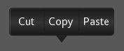
The Bubble widget is a form of menu or a small popup with an arrow
arranged on one side of it’s content.
The Bubble contains an arrow attached to the content
(e.g., BubbleContent) pointing in the direction you choose. It can
be placed either at a predefined location or flexibly by specifying a relative
position on the border of the widget.
The BubbleContent is a styled BoxLayout and is thought to be added to
the Bubble as a child widget. The Bubble will then arrange
an arrow around the content as desired. Instead of the class:BubbleContent,
you can theoretically use any other Widget as well as long as it
supports the ‘bind’ and ‘unbind’ function of the EventDispatcher and
is compatible with Kivy to be placed inside a BoxLayout.
The BubbleButton`is a styled Button. It suits to the style of
:class:`Bubble and BubbleContent. Feel free to place other Widgets
inside the ‘content’ of the Bubble.
Changed in version 2.2.0.
The properties background_image, background_color,
border and border_auto_scale were removed from Bubble.
These properties had only been used by the content widget that now uses it’s
own properties instead. The color of the arrow is now changed with
arrow_color instead of background_color.
These changes makes the Bubble transparent to use with other layouts
as content without any side-effects due to property inheritance.
The property flex_arrow_pos has been added to allow further
customization of the arrow positioning.
The properties arrow_margin, arrow_margin_x,
arrow_margin_y, content_size, content_width and
content_height have been added to ease proper sizing of a
Bubble e.g., based on it’s content size.
BubbleContent
The BubbleContent is a styled BoxLayout that can be used to
add e.g., BubbleButtons as menu items.
Changed in version 2.2.0.
The properties background_image, background_color,
border and border_auto_scale were added to the
BubbleContent. The BubbleContent does no longer rely on these
properties being present in the parent class.
- class kivy.uix.bubble.Bubble(**kwargs)[source]
Bases:
BoxLayoutBubble class. See module documentation for more information.
- add_widget(widget, *args, **kwargs)[source]
Add a new widget as a child of this widget.
- Parameters:
- widget:
Widget Widget to add to our list of children.
- index: int, defaults to 0
Index to insert the widget in the list. Notice that the default of 0 means the widget is inserted at the beginning of the list and will thus be drawn on top of other sibling widgets. For a full discussion of the index and widget hierarchy, please see the Widgets Programming Guide.
Added in version 1.0.5.
- canvas: str, defaults to None
Canvas to add widget’s canvas to. Can be ‘before’, ‘after’ or None for the default canvas.
Added in version 1.9.0.
- widget:
>>> from kivy.uix.button import Button
>>> from kivy.uix.slider import Slider
>>> root = Widget()
>>> root.add_widget(Button())
>>> slider = Slider()
>>> root.add_widget(slider)
- arrow_color
Arrow color, in the format (r, g, b, a). To use it you have to set
arrow_imagefirst.Added in version 2.2.0.
arrow_coloris aColorPropertyand defaults to [1, 1, 1, 1].
- arrow_image
Image of the arrow pointing to the bubble.
arrow_imageis aStringPropertyand defaults to ‘atlas://data/images/defaulttheme/bubble_arrow’.
- arrow_margin
Automatically computed margin that the arrow widget occupies in x and y direction in pixel.
Check the description of
arrow_margin_xandarrow_margin_y.Added in version 2.2.0.
arrow_marginis aReferenceListPropertyof (arrow_margin_x,arrow_margin_y) properties. It is read only.
- arrow_margin_x
Automatically computed margin in x direction that the arrow widget occupies in pixel.
In combination with the
content_width, this property can be used to determine the correct width of the Bubble to exactly enclose the arrow + content by addingcontent_widthandarrow_margin_xAdded in version 2.2.0.
arrow_margin_xis aNumericPropertyand represents the added margin in x direction due to the arrow widget. It defaults to 0 and is read only.
- arrow_margin_y
Automatically computed margin in y direction that the arrow widget occupies in pixel.
In combination with the
content_height, this property can be used to determine the correct height of the Bubble to exactly enclose the arrow + content by addingcontent_heightandarrow_margin_yAdded in version 2.2.0.
arrow_margin_yis aNumericPropertyand represents the added margin in y direction due to the arrow widget. It defaults to 0 and is read only.
- arrow_pos
Specifies the position of the arrow as predefined relative position to the bubble. Can be one of: left_top, left_mid, left_bottom top_left, top_mid, top_right right_top, right_mid, right_bottom bottom_left, bottom_mid, bottom_right.
arrow_posis aOptionPropertyand defaults to ‘bottom_mid’.
- content
This is the object where the main content of the bubble is held.
The content of the Bubble set by ‘add_widget’ and removed with ‘remove_widget’ similarly to the
ActionViewwhich is placed into a class:ActionBarcontentis aObjectPropertyand defaults to None.
- content_height
The height of the content Widget.
Added in version 2.2.0.
content_heightis aNumericPropertyand is the same as self.content.height if content is not None, else it defaults to 0. It is read only.
- content_size
The size of the content Widget.
Added in version 2.2.0.
content_sizeis aReferenceListPropertyof (content_width,content_height) properties. It is read only.
- content_width
The width of the content Widget.
Added in version 2.2.0.
content_widthis aNumericPropertyand is the same as self.content.width if content is not None, else it defaults to 0. It is read only.
- flex_arrow_pos
Specifies the position of the arrow as flex coordinate around the border of the
BubbleWidget. If this property is set to a proper position (relative pixel coordinates within theBubblewidget, it overwrites the settingarrow_pos.Added in version 2.2.0.
flex_arrow_posis aListPropertyand defaults to None.
- limit_to
Specifies the widget to which the bubbles position is restricted.
Added in version 1.6.0.
limit_tois aObjectPropertyand defaults to ‘None’.
- remove_widget(widget, *args, **kwargs)[source]
Remove a widget from the children of this widget.
- Parameters:
- widget:
Widget Widget to remove from our children list.
- widget:
>>> from kivy.uix.button import Button
>>> root = Widget()
>>> button = Button()
>>> root.add_widget(button)
>>> root.remove_widget(button)
- show_arrow
Indicates whether to show arrow.
Added in version 1.8.0.
show_arrowis aBooleanPropertyand defaults to True.
- class kivy.uix.bubble.BubbleButton(**kwargs)[source]
Bases:
ButtonA button intended for use in a BubbleContent widget. You can use a “normal” button class, but it will not look good unless the background is changed.
Rather use this BubbleButton widget that is already defined and provides a suitable background for you.
- class kivy.uix.bubble.BubbleContent(**kwargs)[source]
Bases:
BoxLayoutA styled BoxLayout that can be used as the content widget of a Bubble.
Changed in version 2.2.0.
The graphical appearance of
BubbleContentis now based on it’s own propertiesbackground_image,background_color,borderandborder_auto_scale. The parent widget properties are no longer considered. This makes the BubbleContent a standalone themed BoxLayout.- background_color
Background color, in the format (r, g, b, a). To use it you have to set
background_imagefirst.Added in version 2.2.0.
background_coloris aColorPropertyand defaults to [1, 1, 1, 1].
- background_image
Background image of the bubble.
Added in version 2.2.0.
background_imageis aStringPropertyand defaults to ‘atlas://data/images/defaulttheme/bubble’.
- border
Border used for
BorderImagegraphics instruction. Used with thebackground_image. It should be used when using custom backgrounds.It must be a list of 4 values: (bottom, right, top, left). Read the BorderImage instructions for more information about how to use it.
Added in version 2.2.0.
borderis aListPropertyand defaults to (16, 16, 16, 16)
- border_auto_scale
Specifies the
kivy.graphics.BorderImage.auto_scalevalue on the background BorderImage.Added in version 2.2.0.
border_auto_scaleis aOptionPropertyand defaults to ‘both_lower’.