Table Of Contents
Toggle button
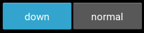
The ToggleButton widget acts like a checkbox. When you touch or click
it, the state toggles between ‘normal’ and ‘down’ (as opposed to a
Button that is only ‘down’ as long as it is pressed).
Toggle buttons can also be grouped to make radio buttons - only one button in a group can be in a ‘down’ state. The group name can be a string or any other hashable Python object:
btn1 = ToggleButton(text='Male', group='sex',)
btn2 = ToggleButton(text='Female', group='sex', state='down')
btn3 = ToggleButton(text='Mixed', group='sex')
Only one of the buttons can be ‘down’/checked at the same time.
To configure the ToggleButton, you can use the same properties that you can use
for a Button class.
- class kivy.uix.togglebutton.ToggleButton(**kwargs)[source]
Bases:
kivy.uix.behaviors.togglebutton.ToggleButtonBehavior,kivy.uix.button.ButtonToggle button class, see module documentation for more information.