Table Of Contents
Popup
New in version 1.0.7.
The Popup widget is used to create modal popups. By default, the popup
will cover the whole “parent” window. When you are creating a popup, you
must at least set a Popup.title and Popup.content.
Remember that the default size of a Widget is size_hint=(1, 1). If you don’t want your popup to be fullscreen, either use size hints with values less than 1 (for instance size_hint=(.8, .8)) or deactivate the size_hint and use fixed size attributes.
Changed in version 1.4.0: The Popup class now inherits from
ModalView. The Popup offers a default
layout with a title and a separation bar.
Examples
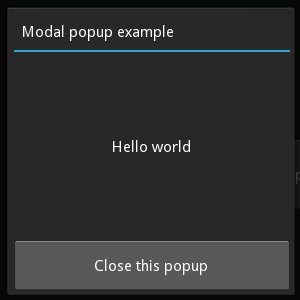
Example of a simple 400x400 Hello world popup:
popup = Popup(title='Test popup',
    content=Label(text='Hello world'),
    size_hint=(None, None), size=(400, 400))
By default, any click outside the popup will dismiss/close it. If you don’t
want that, you can set
auto_dismiss to False:
popup = Popup(title='Test popup', content=Label(text='Hello world'),
              auto_dismiss=False)
popup.open()
To manually dismiss/close the popup, use
dismiss:
popup.dismiss()
Both open() and
dismiss() are bindable. That means you
can directly bind the function to an action, e.g. to a button’s on_press:
# create content and add to the popup
content = Button(text='Close me!')
popup = Popup(content=content, auto_dismiss=False)

# bind the on_press event of the button to the dismiss function
content.bind(on_press=popup.dismiss)

# open the popup
popup.open()
Same thing in KV language only with Factory:
#:import Factory kivy.factory.Factory
<MyPopup@Popup>:
    auto_dismiss: False
    Button:
        text: 'Close me!'
        on_release: root.dismiss()

Button:
    text: 'Open popup'
    on_release: Factory.MyPopup().open()
Note
Popup is a special widget. Don’t try to add it as a child to any other widget. If you do, Popup will be handled like an ordinary widget and won’t be created hidden in the background.
BoxLayout:
    MyPopup:  # bad!
Popup Events
There are two events available: on_open which is raised when the popup is opening, and on_dismiss which is raised when the popup is closed. For on_dismiss, you can prevent the popup from closing by explicitly returning True from your callback:
def my_callback(instance):
    print('Popup', instance, 'is being dismissed but is prevented!')
    return True
popup = Popup(content=Label(text='Hello world'))
popup.bind(on_dismiss=my_callback)
popup.open()
- class kivy.uix.popup.Popup(**kwargs)[source]
Bases:
kivy.uix.modalview.ModalViewPopup class. See module documentation for more information.
- Events:
- on_open:
Fired when the Popup is opened.
- on_dismiss:
Fired when the Popup is closed. If the callback returns True, the dismiss will be canceled.
- add_widget(widget, *args, **kwargs)[source]
Add a new widget as a child of this widget.
- Parameters:
- widget:
Widget Widget to add to our list of children.
- index: int, defaults to 0
Index to insert the widget in the list. Notice that the default of 0 means the widget is inserted at the beginning of the list and will thus be drawn on top of other sibling widgets. For a full discussion of the index and widget hierarchy, please see the Widgets Programming Guide.
New in version 1.0.5.
- canvas: str, defaults to None
Canvas to add widget’s canvas to. Can be ‘before’, ‘after’ or None for the default canvas.
New in version 1.9.0.
- widget:
>>> from kivy.uix.button import Button
>>> from kivy.uix.slider import Slider
>>> root = Widget()
>>> root.add_widget(Button())
>>> slider = Slider()
>>> root.add_widget(slider)
- content
Content of the popup that is displayed just under the title.
contentis anObjectPropertyand defaults to None.
- separator_color
Color used by the separator between title and content.
New in version 1.1.0.
separator_coloris aColorPropertyand defaults to [47 / 255., 167 / 255., 212 / 255., 1.].Changed in version 2.0.0: Changed from
ListPropertytoColorProperty.
- separator_height
Height of the separator.
New in version 1.1.0.
separator_heightis aNumericPropertyand defaults to 2dp.
- title
String that represents the title of the popup.
titleis aStringPropertyand defaults to ‘No title’.
- title_align
Horizontal alignment of the title.
New in version 1.9.0.
title_alignis aOptionPropertyand defaults to ‘left’. Available options are left, center, right and justify.
- title_color
Color used by the Title.
New in version 1.8.0.
title_coloris aColorPropertyand defaults to [1, 1, 1, 1].Changed in version 2.0.0: Changed from
ListPropertytoColorProperty.
- title_font
Font used to render the title text.
New in version 1.9.0.
title_fontis aStringPropertyand defaults to ‘Roboto’. This value is taken fromConfig.
- title_size
Represents the font size of the popup title.
New in version 1.6.0.
title_sizeis aNumericPropertyand defaults to ’14sp’.
- exception kivy.uix.popup.PopupException[source]
Bases:
ExceptionPopup exception, fired when multiple content widgets are added to the popup.
New in version 1.4.0.