Table Of Contents
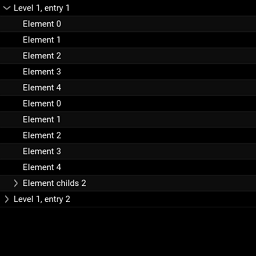
Tree View
New in version 1.0.4.
TreeView is a widget used to represent a tree structure. It is
currently very basic, supporting a minimal feature set.
Introduction
A TreeView is populated with TreeViewNode instances, but you
cannot use a TreeViewNode directly. You must combine it with another
widget, such as Label,
Button or even your own widget. The TreeView
always creates a default root node, based on TreeViewLabel.
TreeViewNode is a class object containing needed properties for
serving as a tree node. Extend TreeViewNode to create custom node
types for use with a TreeView.
For constructing your own subclass, follow the pattern of TreeViewLabel which
combines a Label and a TreeViewNode, producing a TreeViewLabel for
direct use in a TreeView instance.
To use the TreeViewLabel class, you could create two nodes directly attached to root:
tv = TreeView()
tv.add_node(TreeViewLabel(text='My first item'))
tv.add_node(TreeViewLabel(text='My second item'))
Or, create two nodes attached to a first:
tv = TreeView()
n1 = tv.add_node(TreeViewLabel(text='Item 1'))
tv.add_node(TreeViewLabel(text='SubItem 1'), n1)
tv.add_node(TreeViewLabel(text='SubItem 2'), n1)
If you have a large tree structure, perhaps you would need a utility function to populate the tree view:
def populate_tree_view(tree_view, parent, node):
    if parent is None:
        tree_node = tree_view.add_node(TreeViewLabel(text=node['node_id'],
                                                     is_open=True))
    else:
        tree_node = tree_view.add_node(TreeViewLabel(text=node['node_id'],
                                                     is_open=True), parent)

    for child_node in node['children']:
        populate_tree_view(tree_view, tree_node, child_node)


tree = {'node_id': '1',
        'children': [{'node_id': '1.1',
                      'children': [{'node_id': '1.1.1',
                                    'children': [{'node_id': '1.1.1.1',
                                                  'children': []}]},
                                   {'node_id': '1.1.2',
                                    'children': []},
                                   {'node_id': '1.1.3',
                                    'children': []}]},
                      {'node_id': '1.2',
                       'children': []}]}


class TreeWidget(FloatLayout):
    def __init__(self, **kwargs):
        super(TreeWidget, self).__init__(**kwargs)

        tv = TreeView(root_options=dict(text='Tree One'),
                      hide_root=False,
                      indent_level=4)

        populate_tree_view(tv, None, tree)

        self.add_widget(tv)
The root widget in the tree view is opened by default and has text set as
‘Root’. If you want to change that, you can use the
TreeView.root_options
property. This will pass options to the root widget:
tv = TreeView(root_options=dict(text='My root label'))
Creating Your Own Node Widget
For a button node type, combine a Button and a
TreeViewNode as follows:
class TreeViewButton(Button, TreeViewNode):
    pass
You must know that, for a given node, only the
size_hint_x will be honored. The allocated
width for the node will depend of the current width of the TreeView and the
level of the node. For example, if a node is at level 4, the width
allocated will be:
treeview.width - treeview.indent_start - treeview.indent_level * node.level
You might have some trouble with that. It is the developer’s responsibility to correctly handle adapting the graphical representation nodes, if needed.
-
class
kivy.uix.treeview.TreeView(**kwargs)[source]¶ Bases:
kivy.uix.widget.WidgetTreeView class. See module documentation for more information.
Events: - on_node_expand: (node, )
Fired when a node is being expanded
- on_node_collapse: (node, )
Fired when a node is being collapsed
-
add_node(node, parent=None)[source]¶ Add a new node to the tree.
Parameters: - node: instance of a
TreeViewNode Node to add into the tree
- parent: instance of a
TreeViewNode, defaults to None Parent node to attach the new node. If None, it is added to the
rootnode.
Returns: the node node.
- node: instance of a
-
hide_root¶ Use this property to show/hide the initial root node. If True, the root node will be appear as a closed node.
hide_rootis aBooleanPropertyand defaults to False.
-
indent_level¶ Width used for the indentation of each level except the first level.
Computation of indent for each level of the tree is:
indent = indent_start + level * indent_level
indent_levelis aNumericPropertyand defaults to 16.
-
indent_start¶ Indentation width of the level 0 / root node. This is mostly the initial size to accommodate a tree icon (collapsed / expanded). See
indent_levelfor more information about the computation of level indentation.indent_startis aNumericPropertyand defaults to 24.
-
iterate_all_nodes(node=None)[source]¶ Generator to iterate over all nodes from node and down whether expanded or not. If node is None, the generator start with
root.
-
iterate_open_nodes(node=None)[source]¶ Generator to iterate over all the expended nodes starting from node and down. If node is None, the generator start with
root.To get all the open nodes:
treeview = TreeView()
# ... add nodes ...
for node in treeview.iterate_open_nodes():
    print(node)
-
load_func¶ Callback to use for asynchronous loading. If set, asynchronous loading will be automatically done. The callback must act as a Python generator function, using yield to send data back to the treeview.
The callback should be in the format:
def callback(treeview, node):
    for name in ('Item 1', 'Item 2'):
        yield TreeViewLabel(text=name)
load_funcis aObjectPropertyand defaults to None.
-
minimum_height¶ Minimum height needed to contain all children.
New in version 1.0.9.
minimum_heightis aNumericPropertyand defaults to 0.
-
minimum_size¶ Minimum size needed to contain all children.
New in version 1.0.9.
minimum_sizeis aReferenceListPropertyof (minimum_width,minimum_height) properties.
-
minimum_width¶ Minimum width needed to contain all children.
New in version 1.0.9.
minimum_widthis aNumericPropertyand defaults to 0.
-
on_touch_down(touch)[source]¶ Receive a touch down event.
Parameters: - touch:
MotionEventclass Touch received. The touch is in parent coordinates. See
relativelayoutfor a discussion on coordinate systems.
Returns: bool If True, the dispatching of the touch event will stop. If False, the event will continue to be dispatched to the rest of the widget tree.
- touch:
-
remove_node(node)[source]¶ Removes a node from the tree.
New in version 1.0.7.
Parameters: - node: instance of a
TreeViewNode Node to remove from the tree. If node is
root, it is not removed.
- node: instance of a
-
root¶ Root node.
By default, the root node widget is a
TreeViewLabelwith text ‘Root’. If you want to change the default options passed to the widget creation, use theroot_optionsproperty:treeview = TreeView(root_options={ 'text': 'Root directory', 'font_size': 15})
root_optionswill change the properties of theTreeViewLabelinstance. However, you cannot change the class used for root node yet.rootis anAliasPropertyand defaults to None. It is read-only. However, the content of the widget can be changed.
-
root_options¶ Default root options to pass for root widget. See
rootproperty for more information about the usage of root_options.root_optionsis anObjectPropertyand defaults to {}.
-
selected_node¶ Node selected by
TreeView.select_node()or by touch.selected_nodeis aAliasPropertyand defaults to None. It is read-only.
-
exception
kivy.uix.treeview.TreeViewException[source]¶ Bases:
ExceptionException for errors in the
TreeView.
-
class
kivy.uix.treeview.TreeViewLabel(**kwargs)[source]¶ Bases:
kivy.uix.label.Label,kivy.uix.treeview.TreeViewNodeCombines a
Labeland aTreeViewNodeto create aTreeViewLabelthat can be used as a text node in the tree.See module documentation for more information.
-
class
kivy.uix.treeview.TreeViewNode(**kwargs)[source]¶ Bases:
builtins.objectTreeViewNode class, used to build a node class for a TreeView object.
-
color_selected¶ Background color of the node when the node is selected.
color_selectedis aListPropertyand defaults to [.1, .1, .1, 1].
-
even_color¶ Background color of even nodes when the node is not selected.
bg_coloris aListPropertyans defaults to [.5, .5, .5, .1].
-
is_leaf¶ Boolean to indicate whether this node is a leaf or not. Used to adjust the graphical representation.
is_leafis aBooleanPropertyand defaults to True. It is automatically set to False when child is added.
-
is_loaded¶ Boolean to indicate whether this node is already loaded or not. This property is used only if the
TreeViewuses asynchronous loading.is_loadedis aBooleanPropertyand defaults to False.
-
is_open¶ Boolean to indicate whether this node is opened or not, in case there are child nodes. This is used to adjust the graphical representation.
Warning
This property is automatically set by the
TreeView. You can read but not write it.is_openis aBooleanPropertyand defaults to False.
-
is_selected¶ Boolean to indicate whether this node is selected or not. This is used adjust the graphical representation.
Warning
This property is automatically set by the
TreeView. You can read but not write it.is_selectedis aBooleanPropertyand defaults to False.
-
level¶ Level of the node.
levelis aNumericPropertyand defaults to -1.
-
no_selection¶ - Boolean used to indicate whether selection of the node is allowed or
- not.
no_selectionis aBooleanPropertyand defaults to False.
-
nodes¶ List of nodes. The nodes list is different than the children list. A node in the nodes list represents a node on the tree. An item in the children list represents the widget associated with the node.
Warning
This property is automatically set by the
TreeView. You can read but not write it.nodesis aListPropertyand defaults to [].
-
odd¶ This property is set by the TreeView widget automatically and is read-only.
oddis aBooleanPropertyand defaults to False.
-
odd_color¶ Background color of odd nodes when the node is not selected.
odd_coloris aListPropertyand defaults to [1., 1., 1., 0.].
-
parent_node¶ Parent node. This attribute is needed because the
parentcan be None when the node is not displayed.New in version 1.0.7.
parent_nodeis anObjectPropertyand defaults to None.
-