Table Of Contents
Drop-Down List

New in version 1.4.0.
A versatile drop-down list that can be used with custom widgets. It allows you to display a list of widgets under a displayed widget. Unlike other toolkits, the list of widgets can contain any type of widget: simple buttons, images etc.
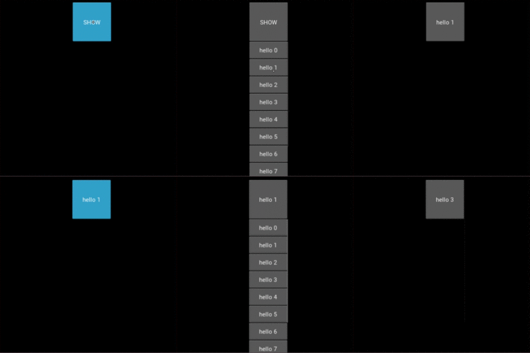
The positioning of the drop-down list is fully automatic: we will always try to place the dropdown list in a way that the user can select an item in the list.
Basic example
A button with a dropdown list of 10 possible values. All the buttons within the
dropdown list will trigger the dropdown DropDown.select() method. After
being called, the main button text will display the selection of the
dropdown.
from kivy.uix.dropdown import DropDown
from kivy.uix.button import Button
from kivy.base import runTouchApp

# create a dropdown with 10 buttons
dropdown = DropDown()
for index in range(10):
    # When adding widgets, we need to specify the height manually
    # (disabling the size_hint_y) so the dropdown can calculate
    # the area it needs.

    btn = Button(text='Value %d' % index, size_hint_y=None, height=44)

    # for each button, attach a callback that will call the select() method
    # on the dropdown. We'll pass the text of the button as the data of the
    # selection.
    btn.bind(on_release=lambda btn: dropdown.select(btn.text))

    # then add the button inside the dropdown
    dropdown.add_widget(btn)

# create a big main button
mainbutton = Button(text='Hello', size_hint=(None, None))

# show the dropdown menu when the main button is released
# note: all the bind() calls pass the instance of the caller (here, the
# mainbutton instance) as the first argument of the callback (here,
# dropdown.open.).
mainbutton.bind(on_release=dropdown.open)

# one last thing, listen for the selection in the dropdown list and
# assign the data to the button text.
dropdown.bind(on_select=lambda instance, x: setattr(mainbutton, 'text', x))

runTouchApp(mainbutton)
Extending dropdown in Kv
You could create a dropdown directly from your kv:
#:kivy 1.4.0
<CustomDropDown>:
    Button:
        text: 'My first Item'
        size_hint_y: None
        height: 44
        on_release: root.select('item1')
    Label:
        text: 'Unselectable item'
        size_hint_y: None
        height: 44
    Button:
        text: 'My second Item'
        size_hint_y: None
        height: 44
        on_release: root.select('item2')
And then, create the associated python class and use it:
class CustomDropDown(DropDown):
    pass

dropdown = CustomDropDown()
mainbutton = Button(text='Hello', size_hint=(None, None))
mainbutton.bind(on_release=dropdown.open)
dropdown.bind(on_select=lambda instance, x: setattr(mainbutton, 'text', x))
-
class
kivy.uix.dropdown.DropDown(**kwargs)[source]¶ Bases:
kivy.uix.scrollview.ScrollViewDropDown class. See module documentation for more information.
Events: - on_select: data
Fired when a selection is done. The data of the selection is passed in as the first argument and is what you pass in the
select()method as the first argument.- on_dismiss:
New in version 1.8.0.
Fired when the DropDown is dismissed, either on selection or on touching outside the widget.
-
add_widget(*largs)[source]¶ Add a new widget as a child of this widget.
Parameters: - widget:
Widget Widget to add to our list of children.
- index: int, defaults to 0
Index to insert the widget in the list. Notice that the default of 0 means the widget is inserted at the beginning of the list and will thus be drawn on top of other sibling widgets. For a full discussion of the index and widget hierarchy, please see the Widgets Programming Guide.
New in version 1.0.5.
- canvas: str, defaults to None
Canvas to add widget’s canvas to. Can be ‘before’, ‘after’ or None for the default canvas.
New in version 1.9.0.
>>> from kivy.uix.button import Button
>>> from kivy.uix.slider import Slider
>>> root = Widget()
>>> root.add_widget(Button())
>>> slider = Slider()
>>> root.add_widget(slider)
- widget:
-
attach_to¶ (internal) Property that will be set to the widget to which the drop down list is attached.
The
open()method will automatically set this property whilstdismiss()will set it back to None.
-
auto_dismiss¶ By default, the dropdown will be automatically dismissed when a touch happens outside of it, this option allows to disable this feature
auto_dismissis aBooleanPropertyand defaults to True.New in version 1.8.0.
-
auto_width¶ By default, the width of the dropdown will be the same as the width of the attached widget. Set to False if you want to provide your own width.
auto_widthis aBooleanPropertyand defaults to True.
-
clear_widgets()[source]¶ Remove all (or the specified)
childrenof this widget. If the ‘children’ argument is specified, it should be a list (or filtered list) of children of the current widget.Changed in version 1.8.0: The children argument can be used to specify the children you want to remove.
-
container¶ (internal) Property that will be set to the container of the dropdown list. It is a
GridLayoutby default.
-
dismiss(*largs)[source]¶ Remove the dropdown widget from the window and detach it from the attached widget.
-
dismiss_on_select¶ By default, the dropdown will be automatically dismissed when a selection has been done. Set to False to prevent the dismiss.
dismiss_on_selectis aBooleanPropertyand defaults to True.
-
max_height¶ Indicate the maximum height that the dropdown can take. If None, it will take the maximum height available until the top or bottom of the screen is reached.
max_heightis aNumericPropertyand defaults to None.
-
min_state_time¶ Minimum time before the
DropDownis dismissed. This is used to allow for the widget inside the dropdown to display a down state or for theDropDownitself to display a animation for closing.min_state_timeis aNumericPropertyand defaults to the Config value min_state_time.New in version 1.10.0.
-
on_touch_down(touch)[source]¶ Receive a touch down event.
Parameters: - touch:
MotionEventclass Touch received. The touch is in parent coordinates. See
relativelayoutfor a discussion on coordinate systems.
Returns: bool If True, the dispatching of the touch event will stop. If False, the event will continue to be dispatched to the rest of the widget tree.
- touch:
-
on_touch_up(touch)[source]¶ Receive a touch up event. The touch is in parent coordinates.
See
on_touch_down()for more information.
-
open(widget)[source]¶ Open the dropdown list and attach it to a specific widget. Depending on the position of the widget within the window and the height of the dropdown, the dropdown might be above or below that widget.
