Table Of Contents
CheckBox
New in version 1.4.0.
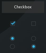
CheckBox is a specific two-state button that can be either checked or
unchecked. If the CheckBox is in a Group, it becomes a Radio button.
As with the ToggleButton, only one Radio button
at a time can be selected when the CheckBox.group is set.
An example usage:
from kivy.uix.checkbox import CheckBox

# ...

def on_checkbox_active(checkbox, value):
    if value:
        print('The checkbox', checkbox, 'is active')
    else:
        print('The checkbox', checkbox, 'is inactive')

checkbox = CheckBox()
checkbox.bind(active=on_checkbox_active)
-
class
kivy.uix.checkbox.CheckBox(**kwargs)[source]¶ Bases:
kivy.uix.behaviors.togglebutton.ToggleButtonBehavior,kivy.uix.widget.WidgetCheckBox class, see module documentation for more information.
-
active¶ Indicates if the switch is active or inactive.
activeis a boolean and reflects and sets whether the underlyingstateis ‘down’ (True) or ‘normal’ (False). It is aAliasProperty, which accepts boolean values and defaults to False.Changed in version 1.11.0: It changed from a BooleanProperty to a AliasProperty.
-
background_checkbox_disabled_down¶ Background image of the checkbox used for the default graphical representation when the checkbox is disabled and active.
New in version 1.9.0.
background_checkbox_disabled_downis aStringPropertyand defaults to ‘atlas://data/images/defaulttheme/checkbox_disabled_on’.
-
background_checkbox_disabled_normal¶ Background image of the checkbox used for the default graphical representation when the checkbox is disabled and not active.
New in version 1.9.0.
background_checkbox_disabled_normalis aStringPropertyand defaults to ‘atlas://data/images/defaulttheme/checkbox_disabled_off’.
-
background_checkbox_down¶ Background image of the checkbox used for the default graphical representation when the checkbox is active.
New in version 1.9.0.
background_checkbox_downis aStringPropertyand defaults to ‘atlas://data/images/defaulttheme/checkbox_on’.
-
background_checkbox_normal¶ Background image of the checkbox used for the default graphical representation when the checkbox is not active.
New in version 1.9.0.
background_checkbox_normalis aStringPropertyand defaults to ‘atlas://data/images/defaulttheme/checkbox_off’.
-
background_radio_disabled_down¶ Background image of the radio button used for the default graphical representation when the radio button is disabled and active.
New in version 1.9.0.
background_radio_disabled_downis aStringPropertyand defaults to ‘atlas://data/images/defaulttheme/checkbox_radio_disabled_on’.
-
background_radio_disabled_normal¶ Background image of the radio button used for the default graphical representation when the radio button is disabled and not active.
New in version 1.9.0.
background_radio_disabled_normalis aStringPropertyand defaults to ‘atlas://data/images/defaulttheme/checkbox_radio_disabled_off’.
-
background_radio_down¶ Background image of the radio button used for the default graphical representation when the radio button is active.
New in version 1.9.0.
background_radio_downis aStringPropertyand defaults to ‘atlas://data/images/defaulttheme/checkbox_radio_on’.
-
background_radio_normal¶ Background image of the radio button used for the default graphical representation when the radio button is not active.
New in version 1.9.0.
background_radio_normalis aStringPropertyand defaults to ‘atlas://data/images/defaulttheme/checkbox_radio_off’.
-
color¶ Color is used for tinting the default graphical representation of checkbox and radio button (images).
Color is in the format (r, g, b, a).
New in version 1.10.0.
coloris aListPropertyand defaults to ‘[1, 1, 1, 1]’.
-