Table Of Contents
Anchor Layout

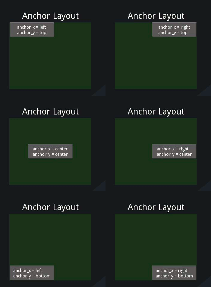
The AnchorLayout aligns its children to a border (top, bottom,
left, right) or center.
To draw a button in the lower-right corner:
layout = AnchorLayout(
    anchor_x='right', anchor_y='bottom')
btn = Button(text='Hello World')
layout.add_widget(btn)
-
class
kivy.uix.anchorlayout.AnchorLayout(**kwargs)[source]¶ Bases:
kivy.uix.layout.LayoutAnchor layout class. See the module documentation for more information.
-
anchor_x¶ Horizontal anchor.
anchor_xis anOptionPropertyand defaults to ‘center’. It accepts values of ‘left’, ‘center’ or ‘right’.
-
anchor_y¶ Vertical anchor.
anchor_yis anOptionPropertyand defaults to ‘center’. It accepts values of ‘top’, ‘center’ or ‘bottom’.
-
do_layout(*largs)[source]¶ This function is called when a layout is called by a trigger. If you are writing a new Layout subclass, don’t call this function directly but use
_trigger_layout()instead.The function is by default called before the next frame, therefore the layout isn’t updated immediately. Anything depending on the positions of e.g. children should be scheduled for the next frame.
New in version 1.0.8.
-
padding¶ Padding between the widget box and its children, in pixels: [padding_left, padding_top, padding_right, padding_bottom].
padding also accepts a two argument form [padding_horizontal, padding_vertical] and a one argument form [padding].
paddingis aVariableListPropertyand defaults to [0, 0, 0, 0].
-
