Table Of Contents
Button

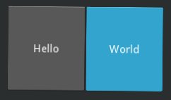
The Button is a Label with associated actions
that are triggered when the button is pressed (or released after a
click/touch). To configure the button, the same properties (padding,
font_size, etc) and
sizing system
are used as for the Label class:
button = Button(text='Hello world', font_size=14)
To attach a callback when the button is pressed (clicked/touched), use
bind:
def callback(instance):
    print('The button <%s> is being pressed' % instance.text)

btn1 = Button(text='Hello world 1')
btn1.bind(on_press=callback)
btn2 = Button(text='Hello world 2')
btn2.bind(on_press=callback)
If you want to be notified every time the button state changes, you can bind
to the Button.state property:
def callback(instance, value):
    print('My button <%s> state is <%s>' % (instance, value))
btn1 = Button(text='Hello world 1')
btn1.bind(state=callback)
Kv Example:
Button:
    text: 'press me'
    on_press: print("ouch! More gently please")
    on_release: print("ahhh")
    on_state:
        print("my current state is {}".format(self.state))
Bases:
kivy.uix.behaviors.button.ButtonBehavior,kivy.uix.label.LabelButton class, see module documentation for more information.
Changed in version 1.8.0: The behavior / logic of the button has been moved to
ButtonBehaviors.Background color, in the format (r, g, b, a).
This acts as a multiplier to the texture colour. The default texture is grey, so just setting the background color will give a darker result. To set a plain color, set the
background_normalto''.New in version 1.0.8.
The
background_coloris aListPropertyand defaults to [1, 1, 1, 1].
Background image of the button used for the default graphical representation when the button is disabled and pressed.
New in version 1.8.0.
background_disabled_downis aStringPropertyand defaults to ‘atlas://data/images/defaulttheme/button_disabled_pressed’.
Background image of the button used for the default graphical representation when the button is disabled and not pressed.
New in version 1.8.0.
background_disabled_normalis aStringPropertyand defaults to ‘atlas://data/images/defaulttheme/button_disabled’.
Background image of the button used for the default graphical representation when the button is pressed.
New in version 1.0.4.
background_downis aStringPropertyand defaults to ‘atlas://data/images/defaulttheme/button_pressed’.
Background image of the button used for the default graphical representation when the button is not pressed.
New in version 1.0.4.
background_normalis aStringPropertyand defaults to ‘atlas://data/images/defaulttheme/button’.
Border used for
BorderImagegraphics instruction. Used withbackground_normalandbackground_down. Can be used for custom backgrounds.It must be a list of four values: (bottom, right, top, left). Read the BorderImage instruction for more information about how to use it.
borderis aListPropertyand defaults to (16, 16, 16, 16)
