Table Of Contents
Bubble
New in version 1.1.0.
The Bubble widget is a form of menu or a small popup where the menu options are stacked either vertically or horizontally.
The Bubble contains an arrow pointing in the direction you
choose.
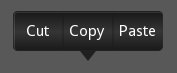
Simple example
'''
Bubble
======

Test of the widget Bubble.
'''

from kivy.app import App
from kivy.uix.floatlayout import FloatLayout
from kivy.uix.button import Button
from kivy.lang import Builder
from kivy.uix.bubble import Bubble

Builder.load_string('''
<cut_copy_paste>
    size_hint: (None, None)
    size: (160, 120)
    pos_hint: {'center_x': .5, 'y': .6}
    BubbleButton:
        text: 'Cut'
    BubbleButton:
        text: 'Copy'
    BubbleButton:
        text: 'Paste'
''')


class cut_copy_paste(Bubble):
    pass


class BubbleShowcase(FloatLayout):

    def __init__(self, **kwargs):
        super(BubbleShowcase, self).__init__(**kwargs)
        self.but_bubble = Button(text='Press to show bubble')
        self.but_bubble.bind(on_release=self.show_bubble)
        self.add_widget(self.but_bubble)

    def show_bubble(self, *l):
        if not hasattr(self, 'bubb'):
            self.bubb = bubb = cut_copy_paste()
            self.add_widget(bubb)
        else:
            values = ('left_top', 'left_mid', 'left_bottom', 'top_left',
                'top_mid', 'top_right', 'right_top', 'right_mid',
                'right_bottom', 'bottom_left', 'bottom_mid', 'bottom_right')
            index = values.index(self.bubb.arrow_pos)
            self.bubb.arrow_pos = values[(index + 1) % len(values)]


class TestBubbleApp(App):

    def build(self):
        return BubbleShowcase()


if __name__ == '__main__':
    TestBubbleApp().run()
Customize the Bubble
You can choose the direction in which the arrow points:
Bubble(arrow_pos='top_mid')
The widgets added to the Bubble are ordered horizontally by default, like a Boxlayout. You can change that by:
orientation = 'vertical'
To add items to the bubble:
bubble = Bubble(orientation = 'vertical')
bubble.add_widget(your_widget_instance)
To remove items:
bubble.remove_widget(widget)
or
bubble.clear_widgets()
To access the list of children, use content.children:
bubble.content.children
Warning
This is important! Do not use bubble.children
To change the appearance of the bubble:
bubble.background_color = (1, 0, 0, .5) #50% translucent red
bubble.border = [0, 0, 0, 0]
background_image = 'path/to/background/image'
arrow_image = 'path/to/arrow/image'
-
class
kivy.uix.bubble.Bubble(**kwargs)[source]¶ Bases:
kivy.uix.gridlayout.GridLayoutBubble class. See module documentation for more information.
-
add_widget(*l)[source]¶ Add a new widget as a child of this widget.
- Parameters
- widget:
Widget Widget to add to our list of children.
- index: int, defaults to 0
Index to insert the widget in the list. Notice that the default of 0 means the widget is inserted at the beginning of the list and will thus be drawn on top of other sibling widgets. For a full discussion of the index and widget hierarchy, please see the Widgets Programming Guide.
New in version 1.0.5.
- canvas: str, defaults to None
Canvas to add widget’s canvas to. Can be ‘before’, ‘after’ or None for the default canvas.
New in version 1.9.0.
- widget:
>>> from kivy.uix.button import Button
>>> from kivy.uix.slider import Slider
>>> root = Widget()
>>> root.add_widget(Button())
>>> slider = Slider()
>>> root.add_widget(slider)
-
arrow_image¶ Image of the arrow pointing to the bubble.
arrow_imageis aStringPropertyand defaults to ‘atlas://data/images/defaulttheme/bubble_arrow’.
-
arrow_pos¶ Specifies the position of the arrow relative to the bubble. Can be one of: left_top, left_mid, left_bottom top_left, top_mid, top_right right_top, right_mid, right_bottom bottom_left, bottom_mid, bottom_right.
arrow_posis aOptionPropertyand defaults to ‘bottom_mid’.
-
background_color¶ Background color, in the format (r, g, b, a). To use it you have to set either
background_imageorarrow_imagefirst.background_coloris aListPropertyand defaults to [1, 1, 1, 1].
-
background_image¶ Background image of the bubble.
background_imageis aStringPropertyand defaults to ‘atlas://data/images/defaulttheme/bubble’.
-
border¶ Border used for
BorderImagegraphics instruction. Used with thebackground_image. It should be used when using custom backgrounds.It must be a list of 4 values: (bottom, right, top, left). Read the BorderImage instructions for more information about how to use it.
borderis aListPropertyand defaults to (16, 16, 16, 16)
-
border_auto_scale¶ Specifies the
kivy.graphics.BorderImage.auto_scalevalue on the background BorderImage.New in version 1.11.0.
border_auto_scaleis aOptionPropertyand defaults to ‘both_lower’.
-
clear_widgets(**kwargs)[source]¶ Remove all (or the specified)
childrenof this widget. If the ‘children’ argument is specified, it should be a list (or filtered list) of children of the current widget.Changed in version 1.8.0: The children argument can be used to specify the children you want to remove.
-
content¶ This is the object where the main content of the bubble is held.
contentis aObjectPropertyand defaults to ‘None’.
-
limit_to¶ Specifies the widget to which the bubbles position is restricted.
New in version 1.6.0.
limit_tois aObjectPropertyand defaults to ‘None’.
-
orientation¶ This specifies the manner in which the children inside bubble are arranged. Can be one of ‘vertical’ or ‘horizontal’.
orientationis aOptionPropertyand defaults to ‘horizontal’.
-
remove_widget(*l)[source]¶ Remove a widget from the children of this widget.
- Parameters
- widget:
Widget Widget to remove from our children list.
- widget:
>>> from kivy.uix.button import Button
>>> root = Widget()
>>> button = Button()
>>> root.add_widget(button)
>>> root.remove_widget(button)
-
show_arrow¶ Indicates whether to show arrow.
New in version 1.8.0.
show_arrowis aBooleanPropertyand defaults to True.
-
-
class
kivy.uix.bubble.BubbleButton(**kwargs)[source]¶ Bases:
kivy.uix.button.ButtonA button intended for use in a Bubble widget. You can use a “normal” button class, but it will not look good unless the background is changed.
Rather use this BubbleButton widget that is already defined and provides a suitable background for you.