Table Of Contents
Slider
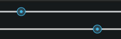
The Slider widget looks like a scrollbar. It supports horizontal and
vertical orientations, min/max values and a default value.
To create a slider from -100 to 100 starting from 25:
from kivy.uix.slider import Slider
s = Slider(min=-100, max=100, value=25)
To create a vertical slider:
from kivy.uix.slider import Slider
s = Slider(orientation='vertical')
To create a slider with a red line tracking the value:
from kivy.uix.slider import Slider
s = Slider(value_track=True, value_track_color=[1, 0, 0, 1])
-
class
kivy.uix.slider.Slider(**kwargs)[source]¶ Bases:
kivy.uix.widget.WidgetClass for creating a Slider widget.
Check module documentation for more details.
-
background_disabled_horizontal¶ Background of the disabled slider used in the horizontal orientation.
New in version 1.10.0.
background_disabled_horizontalis aStringPropertyand defaults to atlas://data/images/defaulttheme/sliderh_background_disabled.
-
background_disabled_vertical¶ Background of the disabled slider used in the vertical orientation.
New in version 1.10.0.
background_disabled_verticalis aStringPropertyand defaults to atlas://data/images/defaulttheme/sliderv_background_disabled.
-
background_horizontal¶ Background of the slider used in the horizontal orientation.
New in version 1.10.0.
background_horizontalis aStringPropertyand defaults to atlas://data/images/defaulttheme/sliderh_background.
-
background_vertical¶ Background of the slider used in the vertical orientation.
New in version 1.10.0.
background_verticalis aStringPropertyand defaults to atlas://data/images/defaulttheme/sliderv_background.
-
background_width¶ Slider’s background’s width (thickness), used in both horizontal and vertical orientations.
background_widthis aNumericPropertyand defaults to 36sp.
-
border_horizontal¶ Border used to draw the slider background in horizontal orientation.
border_horizontalis aListPropertyand defaults to [0, 18, 0, 18].
-
border_vertical¶ Border used to draw the slider background in vertical orientation.
border_horizontalis aListPropertyand defaults to [18, 0, 18, 0].
-
cursor_disabled_image¶ Path of the image used to draw the disabled slider cursor.
cursor_imageis aStringPropertyand defaults to atlas://data/images/defaulttheme/slider_cursor_disabled.
-
cursor_height¶ Height of the cursor image.
cursor_heightis aNumericPropertyand defaults to 32sp.
-
cursor_image¶ Path of the image used to draw the slider cursor.
cursor_imageis aStringPropertyand defaults to atlas://data/images/defaulttheme/slider_cursor.
-
cursor_size¶ Size of the cursor image.
cursor_sizeis aReferenceListPropertyof (cursor_width,cursor_height) properties.
-
cursor_width¶ Width of the cursor image.
cursor_widthis aNumericPropertyand defaults to 32sp.
-
max¶ Maximum value allowed for
value.maxis aNumericPropertyand defaults to 100.
-
min¶ Minimum value allowed for
value.minis aNumericPropertyand defaults to 0.
-
on_touch_down(touch)[source]¶ Receive a touch down event.
Parameters: - touch:
MotionEventclass Touch received. The touch is in parent coordinates. See
relativelayoutfor a discussion on coordinate systems.
Returns: bool If True, the dispatching of the touch event will stop. If False, the event will continue to be dispatched to the rest of the widget tree.
- touch:
-
on_touch_move(touch)[source]¶ Receive a touch move event. The touch is in parent coordinates.
See
on_touch_down()for more information.
-
on_touch_up(touch)[source]¶ Receive a touch up event. The touch is in parent coordinates.
See
on_touch_down()for more information.
-
orientation¶ Orientation of the slider.
orientationis anOptionPropertyand defaults to ‘horizontal’. Can take a value of ‘vertical’ or ‘horizontal’.
-
padding¶ Padding of the slider. The padding is used for graphical representation and interaction. It prevents the cursor from going out of the bounds of the slider bounding box.
By default, padding is 16sp. The range of the slider is reduced from padding *2 on the screen. It allows drawing the default cursor of 32sp width without having the cursor go out of the widget.
paddingis aNumericPropertyand defaults to 16sp.
-
range¶ Range of the slider in the format (minimum value, maximum value):
>>> slider = Slider(min=10, max=80)
>>> slider.range
[10, 80]
>>> slider.range = (20, 100)
>>> slider.min
20
>>> slider.max
100
rangeis aReferenceListPropertyof (min,max) properties.
-
sensitivity¶ Whether the touch collides with the whole body of the widget or with the slider handle part only.
New in version 1.10.1.
sensitivityis aOptionPropertyand defaults to ‘all’. Can take a value of ‘all’ or ‘handle’.
-
step¶ Step size of the slider.
New in version 1.4.0.
Determines the size of each interval or step the slider takes between min and max. If the value range can’t be evenly divisible by step the last step will be capped by slider.max
stepis aNumericPropertyand defaults to 1.
-
value¶ Current value used for the slider.
valueis aNumericPropertyand defaults to 0.
-
value_normalized¶ Normalized value inside the
range(min/max) to 0-1 range:>>> slider = Slider(value=50, min=0, max=100) >>> slider.value 50 >>> slider.value_normalized 0.5 >>> slider.value = 0 >>> slider.value_normalized 0 >>> slider.value = 100 >>> slider.value_normalized 1
You can also use it for setting the real value without knowing the minimum and maximum:
>>> slider = Slider(min=0, max=200)
>>> slider.value_normalized = .5
>>> slider.value
100
>>> slider.value_normalized = 1.
>>> slider.value
200
value_normalizedis anAliasProperty.
-
value_pos¶ Position of the internal cursor, based on the normalized value.
value_posis anAliasProperty.
-
value_track¶ Decides if slider should draw the line indicating the space between
minandvalueproperties values.value_trackis aBooleanPropertyand defaults to False.
-
value_track_color¶ Color of the
value_linein rgba format.value_track_coloris aListPropertyand defaults to [1, 1, 1, 1].
-
value_track_width¶ Width of the track line.
value_track_widthis aNumericPropertyand defaults to 3dp.
-