Table Of Contents
- Text Input
- Usage example
- Selection
- Handles
- Filtering
- Default shortcuts
TextInputTextInput.allow_copyTextInput.auto_indentTextInput.background_activeTextInput.background_colorTextInput.background_disabled_normalTextInput.background_normalTextInput.base_directionTextInput.borderTextInput.cancel_selection()TextInput.copy()TextInput.cursorTextInput.cursor_blinkTextInput.cursor_colTextInput.cursor_colorTextInput.cursor_index()TextInput.cursor_offset()TextInput.cursor_posTextInput.cursor_rowTextInput.cursor_widthTextInput.cut()TextInput.delete_selection()TextInput.disabled_foreground_colorTextInput.do_backspace()TextInput.do_cursor_movement()TextInput.do_redo()TextInput.do_undo()TextInput.do_wrapTextInput.font_contextTextInput.font_familyTextInput.font_nameTextInput.font_sizeTextInput.foreground_colorTextInput.get_cursor_from_index()TextInput.get_cursor_from_xy()TextInput.get_max_scroll_x()TextInput.halignTextInput.handle_image_leftTextInput.handle_image_middleTextInput.handle_image_rightTextInput.hint_textTextInput.hint_text_colorTextInput.input_filterTextInput.insert_text()TextInput.keyboard_on_key_down()TextInput.keyboard_on_key_up()TextInput.line_heightTextInput.line_spacingTextInput.lines_to_scrollTextInput.minimum_heightTextInput.multilineTextInput.on_cursor()TextInput.on_cursor_blink()TextInput.on_double_tap()TextInput.on_quad_touch()TextInput.on_touch_down()TextInput.on_touch_move()TextInput.on_touch_up()TextInput.on_triple_tap()TextInput.paddingTextInput.padding_xTextInput.padding_yTextInput.passwordTextInput.password_maskTextInput.paste()TextInput.pgmove_speedTextInput.readonlyTextInput.replace_crlfTextInput.reset_undo()TextInput.scroll_distanceTextInput.scroll_from_swipeTextInput.scroll_timeoutTextInput.scroll_xTextInput.scroll_yTextInput.select_all()TextInput.select_text()TextInput.selection_colorTextInput.selection_fromTextInput.selection_textTextInput.selection_toTextInput.tab_widthTextInput.textTextInput.text_languageTextInput.text_validate_unfocusTextInput.use_bubbleTextInput.use_handlesTextInput.write_tab
Text Input
New in version 1.0.4.

The TextInput widget provides a box for editable plain text.
Unicode, multiline, cursor navigation, selection and clipboard features are supported.
The TextInput uses two different coordinate systems:
(x, y) - coordinates in pixels, mostly used for rendering on screen.
(col, row) - cursor index in characters / lines, used for selection and cursor movement.
Usage example
To create a multiline TextInput (the ‘enter’ key adds a new line):
from kivy.uix.textinput import TextInput
textinput = TextInput(text='Hello world')
To create a singleline TextInput, set the TextInput.multiline
property to False (the ‘enter’ key will defocus the TextInput and emit an
TextInput.on_text_validate() event):
def on_enter(instance, value):
    print('User pressed enter in', instance)

textinput = TextInput(text='Hello world', multiline=False)
textinput.bind(on_text_validate=on_enter)
The textinput’s text is stored in its TextInput.text property. To run a
callback when the text changes:
def on_text(instance, value):
    print('The widget', instance, 'have:', value)

textinput = TextInput()
textinput.bind(text=on_text)
You can set the focus to a
Textinput, meaning that the input box will be highlighted and keyboard focus
will be requested:
textinput = TextInput(focus=True)
The textinput is defocused if the ‘escape’ key is pressed, or if another widget requests the keyboard. You can bind a callback to the focus property to get notified of focus changes:
def on_focus(instance, value):
    if value:
        print('User focused', instance)
    else:
        print('User defocused', instance)

textinput = TextInput()
textinput.bind(focus=on_focus)
See FocusBehavior, from which the
TextInput inherits, for more details.
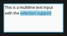
Selection
The selection is automatically updated when the cursor position changes.
You can get the currently selected text from the
TextInput.selection_text property.
Handles
One can enable TextInput.use_handles property to enable or disable
the usage of selection handles. This property is True by default on mobiles.
Selection Handles uses the class Selector as the base class for
the selection handles. You can customize the color for selection handles
like so
<Selector>
    color: 0, 1, 0, 1
    # or <Textinput_instance>.selection_color or app.selection_color
TextInput instantiates the selection handles and stores it in the following
properties. TextInput._handle_middle,
TextInput._handle_left, TextInput._handle_right.
You should set the selection template before the Instantiating TextInput, so as to get the selection handles to take the changes you set to apply.
Filtering
You can control which text can be added to the TextInput by
overwriting TextInput.insert_text(). Every string that is typed, pasted
or inserted by any other means into the TextInput is passed through
this function. By overwriting it you can reject or change unwanted characters.
For example, to write only in capitalized characters:
class CapitalInput(TextInput):

    def insert_text(self, substring, from_undo=False):
        s = substring.upper()
        return super().insert_text(s, from_undo=from_undo)
Or to only allow floats (0 - 9 and a single period):
class FloatInput(TextInput):

    pat = re.compile('[^0-9]')
    def insert_text(self, substring, from_undo=False):
        pat = self.pat
        if '.' in self.text:
            s = re.sub(pat, '', substring)
        else:
            s = '.'.join(
                re.sub(pat, '', s)
                for s in substring.split('.', 1)
            )
        return super().insert_text(s, from_undo=from_undo)
Default shortcuts
Shortcuts |
Description |
Left |
Move cursor to left |
Right |
Move cursor to right |
Up |
Move cursor to up |
Down |
Move cursor to down |
Home |
Move cursor at the beginning of the line |
End |
Move cursor at the end of the line |
PageUp |
Move cursor to 3 lines before |
PageDown |
Move cursor to 3 lines after |
Backspace |
Delete the selection or character before the cursor |
Del |
Delete the selection of character after the cursor |
Shift + <dir> |
Start a text selection. Dir can be Up, Down, Left or Right |
Control + c |
Copy selection |
Control + x |
Cut selection |
Control + v |
Paste clipboard content |
Control + a |
Select all the content |
Control + z |
undo |
Control + r |
redo |
Note
To enable Emacs-style keyboard shortcuts, you can use
EmacsBehavior.
- class kivy.uix.textinput.TextInput(**kwargs)[source]
Bases:
kivy.uix.behaviors.focus.FocusBehavior,kivy.uix.widget.WidgetTextInput class. See module documentation for more information.
- Events:
- on_text_validate
Fired only in multiline=False mode when the user hits ‘enter’. This will also unfocus the textinput.
- on_double_tap
Fired when a double tap happens in the text input. The default behavior selects the text around the cursor position. More info at
on_double_tap().- on_triple_tap
Fired when a triple tap happens in the text input. The default behavior selects the line around the cursor position. More info at
on_triple_tap().- on_quad_touch
Fired when four fingers are touching the text input. The default behavior selects the whole text. More info at
on_quad_touch().
Warning
When changing a
TextInputproperty that requires re-drawing, e.g. modifying thetext, the updates occur on the next clock cycle and not instantly. This might cause any changes to theTextInputthat occur between the modification and the next cycle to be ignored, or to use previous values. For example, after a update to thetext, changing the cursor in the same clock frame will move it using the previous text and will likely end up in an incorrect position. The solution is to schedule any updates to occur on the next clock cycle usingschedule_once().Note
Selection is cancelled when TextInput is focused. If you need to show selection when TextInput is focused, you should delay (use Clock.schedule) the call to the functions for selecting text (select_all, select_text).
Changed in version 1.10.0: background_disabled_active has been removed.
Changed in version 1.9.0:
TextInputnow inherits fromFocusBehavior.keyboard_mode,show_keyboard(),hide_keyboard(),focus(), andinput_typehave been removed since they are now inherited fromFocusBehavior.Changed in version 1.7.0: on_double_tap, on_triple_tap and on_quad_touch events added.
Changed in version 2.1.0:
keyboard_suggestionsis now inherited fromFocusBehavior.- allow_copy
Decides whether to allow copying the text.
New in version 1.8.0.
allow_copyis aBooleanPropertyand defaults to True.
- auto_indent
Automatically indent multiline text.
New in version 1.7.0.
auto_indentis aBooleanPropertyand defaults to False.
- background_active
Background image of the TextInput when it’s in focus.
New in version 1.4.1.
background_activeis aStringPropertyand defaults to ‘atlas://data/images/defaulttheme/textinput_active’.
- background_color
Current color of the background, in (r, g, b, a) format.
New in version 1.2.0.
background_coloris aColorPropertyand defaults to [1, 1, 1, 1] (white).Changed in version 2.0.0: Changed from
ListPropertytoColorProperty.
- background_disabled_normal
Background image of the TextInput when disabled.
New in version 1.8.0.
background_disabled_normalis aStringPropertyand defaults to ‘atlas://data/images/defaulttheme/textinput_disabled’.
- background_normal
Background image of the TextInput when it’s not in focus.
New in version 1.4.1.
background_normalis aStringPropertyand defaults to ‘atlas://data/images/defaulttheme/textinput’.
- base_direction
Base direction of text, this impacts horizontal alignment when
halignis auto (the default). Available options are: None, “ltr” (left to right), “rtl” (right to left) plus “weak_ltr” and “weak_rtl”.Note
This feature requires the Pango text provider.
Note
Weak modes are currently not implemented in Kivy text layout, and have the same effect as setting strong mode.
New in version 1.10.1.
base_directionis anOptionPropertyand defaults to None (autodetect RTL if possible, otherwise LTR).
- border
Border used for
BorderImagegraphics instruction. Used withbackground_normalandbackground_active. Can be used for a custom background.New in version 1.4.1.
It must be a list of four values: (bottom, right, top, left). Read the BorderImage instruction for more information about how to use it.
borderis aListPropertyand defaults to (4, 4, 4, 4).
- copy(data='')[source]
Copy the value provided in argument data into current clipboard. If data is not of type string it will be converted to string. If no data is provided then current selection if present is copied.
New in version 1.8.0.
- cursor
Tuple of (col, row) values indicating the current cursor position. You can set a new (col, row) if you want to move the cursor. The scrolling area will be automatically updated to ensure that the cursor is visible inside the viewport.
cursoris anAliasProperty.
- cursor_blink
This property is used to set whether the graphic cursor should blink or not.
Changed in version 1.10.1: cursor_blink has been refactored to enable switching the blinking on/off and the previous behavior has been moved to a private _cursor_blink property. The previous default value False has been changed to True.
cursor_blinkis aBooleanPropertyand defaults to True.
- cursor_col
Current column of the cursor.
cursor_colis anAliasPropertyto cursor[0], read-only.
- cursor_color
Current color of the cursor, in (r, g, b, a) format.
New in version 1.9.0.
cursor_coloris aColorPropertyand defaults to [1, 0, 0, 1].Changed in version 2.0.0: Changed from
ListPropertytoColorProperty.
- cursor_pos
Current position of the cursor, in (x, y).
cursor_posis anAliasProperty, read-only.
- cursor_row
Current row of the cursor.
cursor_rowis anAliasPropertyto cursor[1], read-only.
- cursor_width
Current width of the cursor.
New in version 1.10.0.
cursor_widthis aNumericPropertyand defaults to ‘1sp’.
- cut()[source]
Copy current selection to clipboard then delete it from TextInput.
New in version 1.8.0.
- disabled_foreground_color
Current color of the foreground when disabled, in (r, g, b, a) format.
New in version 1.8.0.
disabled_foreground_coloris aColorPropertyand defaults to [0, 0, 0, 5] (50% transparent black).Changed in version 2.0.0: Changed from
ListPropertytoColorProperty.
- do_backspace(from_undo=False, mode='bkspc')[source]
Do backspace operation from the current cursor position. This action might do several things:
removing the current selection if available.
removing the previous char and move the cursor back.
do nothing, if we are at the start.
- do_cursor_movement(action, control=False, alt=False)[source]
Move the cursor relative to its current position. Action can be one of :
cursor_left: move the cursor to the left
cursor_right: move the cursor to the right
cursor_up: move the cursor on the previous line
cursor_down: move the cursor on the next line
cursor_home: move the cursor at the start of the current line
cursor_end: move the cursor at the end of current line
cursor_pgup: move one “page” before
cursor_pgdown: move one “page” after
In addition, the behavior of certain actions can be modified:
control + cursor_left: move the cursor one word to the left
control + cursor_right: move the cursor one word to the right
control + cursor_up: scroll up one line
control + cursor_down: scroll down one line
control + cursor_home: go to beginning of text
control + cursor_end: go to end of text
alt + cursor_up: shift line(s) up
alt + cursor_down: shift line(s) down
Changed in version 1.9.1.
- do_redo()[source]
Do redo operation.
New in version 1.3.0.
This action re-does any command that has been un-done by do_undo/ctrl+z. This function is automatically called when ctrl+r keys are pressed.
- do_undo()[source]
Do undo operation.
New in version 1.3.0.
This action un-does any edits that have been made since the last call to reset_undo(). This function is automatically called when ctrl+z keys are pressed.
- do_wrap
If True, and the text is multiline, then lines larger than the width of the widget will wrap around to the next line, avoiding the need for horizontal scrolling. Disabling this option ensure one line is always displayed as one line.
do_wrapis aBooleanPropertyand defaults to True.versionadded:: 2.1.0
- font_context
Font context. None means the font is used in isolation, so you are guaranteed to be drawing with the TTF file resolved by
font_name. Specifying a value here will load the font file into a named context, enabling fallback between all fonts in the same context. If a font context is set, you are not guaranteed that rendering will actually use the specified TTF file for all glyphs (Pango will pick the one it thinks is best).If Kivy is linked against a system-wide installation of FontConfig, you can load the system fonts by specifying a font context starting with the special string system://. This will load the system fontconfig configuration, and add your application-specific fonts on top of it (this imposes a significant risk of family name collision, Pango may not use your custom font file, but pick one from the system)
Note
This feature requires the Pango text provider.
New in version 1.10.1.
font_contextis aStringPropertyand defaults to None.
- font_family
Font family, this is only applicable when using
font_contextoption. The specified font family will be requested, but note that it may not be available, or there could be multiple fonts registered with the same family. The value can be a family name (string) available in the font context (for example a system font in a system:// context, or a custom font file added usingkivy.core.text.FontContextManager). If set to None, font selection is controlled by thefont_namesetting.Note
If using
font_nameto reference a custom font file, you should leave this as None. The family name is managed automatically in this case.Note
This feature requires the Pango text provider.
New in version 1.10.1.
font_familyis aStringPropertyand defaults to None.
- font_name
Filename of the font to use. The path can be absolute or relative. Relative paths are resolved by the
resource_find()function.Warning
Depending on your text provider, the font file may be ignored. However, you can mostly use this without problems.
If the font used lacks the glyphs for the particular language/symbols you are using, you will see ‘[]’ blank box characters instead of the actual glyphs. The solution is to use a font that has the glyphs you need to display. For example, to display
 , use a font like
freesans.ttf that has the glyph.
, use a font like
freesans.ttf that has the glyph.font_nameis aStringPropertyand defaults to ‘Roboto’. This value is taken fromConfig.
- font_size
Font size of the text in pixels.
font_sizeis aNumericPropertyand defaults to 15sp.
- foreground_color
Current color of the foreground, in (r, g, b, a) format.
New in version 1.2.0.
foreground_coloris aColorPropertyand defaults to [0, 0, 0, 1] (black).Changed in version 2.0.0: Changed from
ListPropertytoColorProperty.
- get_max_scroll_x()[source]
Return how many pixels it needs to scroll to the right to reveal the remaining content of a text that extends beyond the visible width of a TextInput
- halign
Horizontal alignment of the text.
halignis anOptionPropertyand defaults to ‘auto’. Available options are : auto, left, center and right. Auto will attempt to autodetect horizontal alignment for RTL text (Pango only), otherwise it behaves like left.New in version 1.10.1.
- handle_image_left
Image used to display the Left handle on the TextInput for selection.
New in version 1.8.0.
handle_image_leftis aStringPropertyand defaults to ‘atlas://data/images/defaulttheme/selector_left’.
- handle_image_middle
Image used to display the middle handle on the TextInput for cursor positioning.
New in version 1.8.0.
handle_image_middleis aStringPropertyand defaults to ‘atlas://data/images/defaulttheme/selector_middle’.
- handle_image_right
Image used to display the Right handle on the TextInput for selection.
New in version 1.8.0.
handle_image_rightis aStringPropertyand defaults to ‘atlas://data/images/defaulttheme/selector_right’.
- hint_text
Hint text of the widget, shown if text is ‘’.
New in version 1.6.0.
Changed in version 1.10.0: The property is now an AliasProperty and byte values are decoded to strings. The hint text will stay visible when the widget is focused.
hint_textaAliasPropertyand defaults to ‘’.
- hint_text_color
Current color of the hint_text text, in (r, g, b, a) format.
New in version 1.6.0.
hint_text_coloris aColorPropertyand defaults to [0.5, 0.5, 0.5, 1.0] (grey).Changed in version 2.0.0: Changed from
ListPropertytoColorProperty.
- input_filter
Filters the input according to the specified mode, if not None. If None, no filtering is applied.
New in version 1.9.0.
input_filteris anObjectPropertyand defaults to None. Can be one of None, ‘int’ (string), or ‘float’ (string), or a callable. If it is ‘int’, it will only accept numbers. If it is ‘float’ it will also accept a single period. Finally, if it is a callable it will be called with two parameters; the string to be added and a bool indicating whether the string is a result of undo (True). The callable should return a new substring that will be used instead.
- insert_text(substring, from_undo=False)[source]
Insert new text at the current cursor position. Override this function in order to pre-process text for input validation.
- keyboard_on_key_down(window, keycode, text, modifiers)[source]
The method bound to the keyboard when the instance has focus.
When the instance becomes focused, this method is bound to the keyboard and will be called for every input press. The parameters are the same as
kivy.core.window.WindowBase.on_key_down().When overwriting the method in the derived widget, super should be called to enable tab cycling. If the derived widget wishes to use tab for its own purposes, it can call super after it has processed the character (if it does not wish to consume the tab).
Similar to other keyboard functions, it should return True if the key was consumed.
- keyboard_on_key_up(window, keycode)[source]
The method bound to the keyboard when the instance has focus.
When the instance becomes focused, this method is bound to the keyboard and will be called for every input release. The parameters are the same as
kivy.core.window.WindowBase.on_key_up().When overwriting the method in the derived widget, super should be called to enable de-focusing on escape. If the derived widget wishes to use escape for its own purposes, it can call super after it has processed the character (if it does not wish to consume the escape).
- line_height
Height of a line. This property is automatically computed from the
font_name,font_size. Changing the line_height will have no impact.Note
line_heightis the height of a single line of text. Useminimum_height, which also includes padding, to get the height required to display the text properly.line_heightis aNumericProperty, read-only.
- line_spacing
Space taken up between the lines.
New in version 1.8.0.
line_spacingis aNumericPropertyand defaults to 0.
- lines_to_scroll
Set how many lines will be scrolled at once when using the mouse scroll wheel.
New in version 2.2.0.
lines_to_scroll is a
:class:`~kivy.properties.BoundedNumericProperty
and defaults to 3, the minimum is 1.
- minimum_height
Minimum height of the content inside the TextInput.
New in version 1.8.0.
minimum_heightis a readonlyAliasProperty.Warning
minimum_widthis calculated based onwidththerefore code like this will lead to an infinite loop:<FancyTextInput>: height: self.minimum_height width: self.height
- multiline
If True, the widget will be able show multiple lines of text. If False, the “enter” keypress will defocus the textinput instead of adding a new line.
multilineis aBooleanPropertyand defaults to True.
- on_cursor(instance, value)[source]
When the cursor is moved, reset cursor blinking to keep it showing, and update all the graphics.
- on_cursor_blink(instance, value)[source]
trigger blink event reset to switch blinking while focused
- on_double_tap()[source]
This event is dispatched when a double tap happens inside TextInput. The default behavior is to select the word around the current cursor position. Override this to provide different behavior. Alternatively, you can bind to this event to provide additional functionality.
- on_quad_touch()[source]
This event is dispatched when four fingers are touching inside TextInput. The default behavior is to select all text. Override this to provide different behavior. Alternatively, you can bind to this event to provide additional functionality.
- on_touch_down(touch)[source]
Receive a touch down event.
- Parameters:
- touch:
MotionEventclass Touch received. The touch is in parent coordinates. See
relativelayoutfor a discussion on coordinate systems.
- touch:
- Returns:
bool If True, the dispatching of the touch event will stop. If False, the event will continue to be dispatched to the rest of the widget tree.
- on_touch_move(touch)[source]
Receive a touch move event. The touch is in parent coordinates.
See
on_touch_down()for more information.
- on_touch_up(touch)[source]
Receive a touch up event. The touch is in parent coordinates.
See
on_touch_down()for more information.
- on_triple_tap()[source]
This event is dispatched when a triple tap happens inside TextInput. The default behavior is to select the line around current cursor position. Override this to provide different behavior. Alternatively, you can bind to this event to provide additional functionality.
- padding
Padding of the text: [padding_left, padding_top, padding_right, padding_bottom].
padding also accepts a two argument form [padding_horizontal, padding_vertical] and a one argument form [padding].
Changed in version 1.7.0: Replaced AliasProperty with VariableListProperty.
paddingis aVariableListPropertyand defaults to [6, 6, 6, 6].
- padding_x
Horizontal padding of the text: [padding_left, padding_right].
padding_x also accepts a one argument form [padding_horizontal].
padding_xis aVariableListPropertyand defaults to [0, 0]. This might be changed by the current theme.Deprecated since version 1.7.0: Use
paddinginstead.
- padding_y
Vertical padding of the text: [padding_top, padding_bottom].
padding_y also accepts a one argument form [padding_vertical].
padding_yis aVariableListPropertyand defaults to [0, 0]. This might be changed by the current theme.Deprecated since version 1.7.0: Use
paddinginstead.
- password
If True, the widget will display its characters as the character set in
password_mask.New in version 1.2.0.
passwordis aBooleanPropertyand defaults to False.
- password_mask
Sets the character used to mask the text when
passwordis True.New in version 1.10.0.
password_maskis aStringPropertyand defaults to ‘*’.
- paste()[source]
Insert text from system
Clipboardinto theTextInputat current cursor position.New in version 1.8.0.
- property pgmove_speed
how much vertical distance hitting pg_up or pg_down will move
- readonly
If True, the user will not be able to change the content of a textinput.
New in version 1.3.0.
readonlyis aBooleanPropertyand defaults to False.
- replace_crlf
Automatically replace CRLF with LF.
New in version 1.9.1.
replace_crlfis aBooleanPropertyand defaults to True.
- scroll_distance
Minimum distance to move before change from scroll to selection mode, in pixels. It is advisable that you base this value on the dpi of your target device’s screen.
New in version 2.1.0.
scroll_distanceis a NumericProperty and defaults to 20 pixels.
- scroll_from_swipe
Allow to scroll the text using swipe gesture according to
scroll_timeoutandscroll_distance.New in version 2.1.0.
scroll_from_swipeis a BooleanProperty and defaults to True on mobile OS’s, False on desktop OS’s.
- scroll_timeout
Timeout allowed to trigger the
scroll_distance, in milliseconds. If the user has not movedscroll_distancewithin the timeout, the scrolling will be disabled, and the selection mode will start.New in version 2.1.0.
scroll_timeoutis a NumericProperty and defaults to 250 milliseconds.
- scroll_x
X scrolling value of the viewport. The scrolling is automatically updated when the cursor is moved or text changed. If there is no user input, the scroll_x and scroll_y properties may be changed.
scroll_xis aNumericPropertyand defaults to 0.
- scroll_y
Y scrolling value of the viewport. See
scroll_xfor more information.scroll_yis aNumericPropertyand defaults to 0.
- select_text(start, end)[source]
Select a portion of text displayed in this TextInput.
New in version 1.4.0.
- Parameters:
- start
Index of textinput.text from where to start selection
- end
Index of textinput.text till which the selection should be displayed
- selection_color
Current color of the selection, in (r, g, b, a) format.
Warning
The color should always have an “alpha” component less than 1 since the selection is drawn after the text.
selection_coloris aColorPropertyand defaults to [0.1843, 0.6549, 0.8313, .5].Changed in version 2.0.0: Changed from
ListPropertytoColorProperty.
- selection_from
If a selection is in progress or complete, this property will represent the cursor index where the selection started.
Changed in version 1.4.0:
selection_fromis anAliasPropertyand defaults to None, readonly.
- selection_text
Current content selection.
selection_textis aStringPropertyand defaults to ‘’, readonly.
- selection_to
If a selection is in progress or complete, this property will represent the cursor index where the selection started.
Changed in version 1.4.0:
selection_tois anAliasPropertyand defaults to None, readonly.
- tab_width
By default, each tab will be replaced by four spaces on the text input widget. You can set a lower or higher value.
tab_widthis aNumericPropertyand defaults to 4.
- text
Text of the widget.
Creation of a simple hello world:
widget = TextInput(text='Hello world')
If you want to create the widget with an unicode string, use:
widget = TextInput(text=u'My unicode string')
textis anAliasProperty.
- text_language
Language of the text, if None Pango will determine it from locale. This is an RFC-3066 format language tag (as a string), for example “en_US”, “zh_CN”, “fr” or “ja”. This can impact font selection, metrics and rendering. For example, the same bytes of text can look different for ur and ar languages, though both use Arabic script.
Note
This feature requires the Pango text provider.
New in version 1.10.1.
text_languageis aStringPropertyand defaults to None.
- text_validate_unfocus
If True, the
TextInput.on_text_validate()event will unfocus the widget, therefore make it stop listening to the keyboard. When disabled, theTextInput.on_text_validate()event can be fired multiple times as the result of TextInput keeping the focus enabled.New in version 1.10.1.
text_validate_unfocusis aBooleanPropertyand defaults to True.
- use_bubble
Indicates whether the cut/copy/paste bubble is used.
New in version 1.7.0.
use_bubbleis aBooleanPropertyand defaults to True on mobile OS’s, False on desktop OS’s.
- use_handles
Indicates whether the selection handles are displayed.
New in version 1.8.0.
use_handlesis aBooleanPropertyand defaults to True on mobile OS’s, False on desktop OS’s.
- write_tab
Whether the tab key should move focus to the next widget or if it should enter a tab in the
TextInput. If True a tab will be written, otherwise, focus will move to the next widget.New in version 1.9.0.
write_tabis aBooleanPropertyand defaults to True.